You can use the following basic syntax to convert an axis in ggplot2 to a percentage scale:
+ scale_y_continuous(labels = scales::percent)
The following example show how to use this syntax in practice.
Example: Convert Axis in ggplot2 to Percentage Scale
Suppose we have the following data frame in R that shows the percentage of items that were returned at four different stores:
#create data frame
df frame(store=c('A', 'B', 'C', 'D'),
                 returns=c(.14, .08, .22, .11))

#view data frame
df

  store returns
1     A    0.14
2     B    0.08
3     C    0.22
4     D    0.11
Now suppose we create a bar chart in ggplot2 to visualize the return percentages for each store:
library(ggplot2)

#create bar chart
ggplot(data=df, aes(x=store, y=returns)) +
  geom_bar(stat='identity')
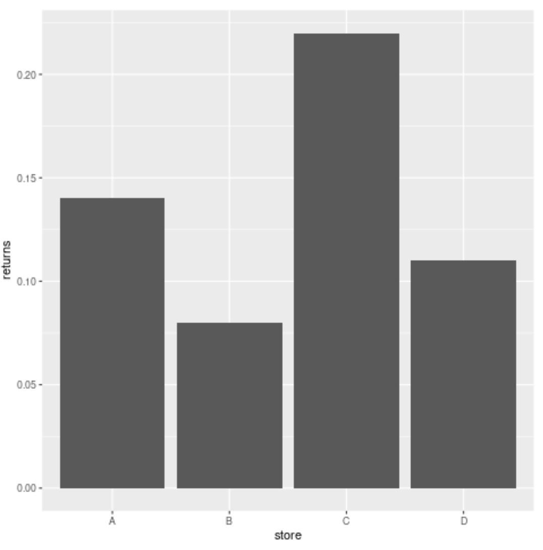
By default, ggplot2 displays the values on the y-axis using decimals.
However, we can use the following syntax to change the y-axis to a percentage scale:
library(ggplot2)

#create bar chart with percentages on y-axis
ggplot(data=df, aes(x=store, y=returns)) +
  geom_bar(stat='identity') +
  scale_y_continuous(labels = scales::percent)
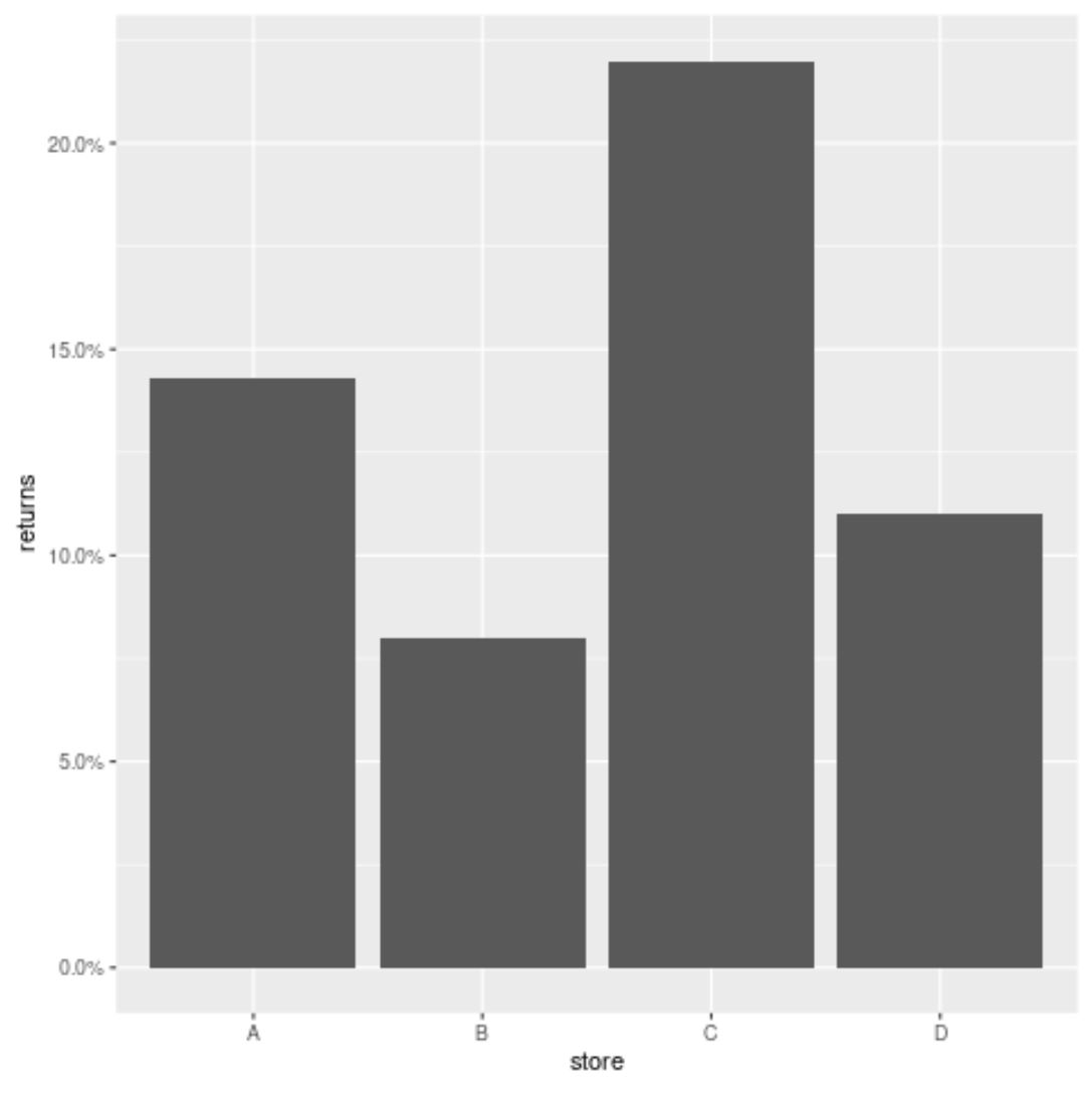
The y-axis now has a percentage scale.
By default, one decimal place is shown. However, we can use the accuracy argument to drop the decimal place from the y-axis:
library(ggplot2)

#create bar chart with percentages on y-axis
ggplot(data=df, aes(x=store, y=returns)) +
  geom_bar(stat='identity') +
  scale_y_continuous(labels = scales::percent_format(accuracy=1))
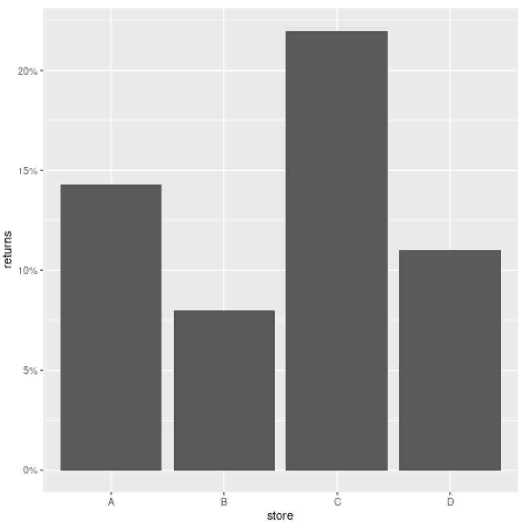
The y-axis is now shown as a percentage without any decimal places.
Additional Resources
The following tutorials explain how to perform other common functions in ggplot2:
How to Remove a Legend in ggplot2
How to Remove Gridlines in ggplot2
How to Rotate Axis Labels in ggplot2