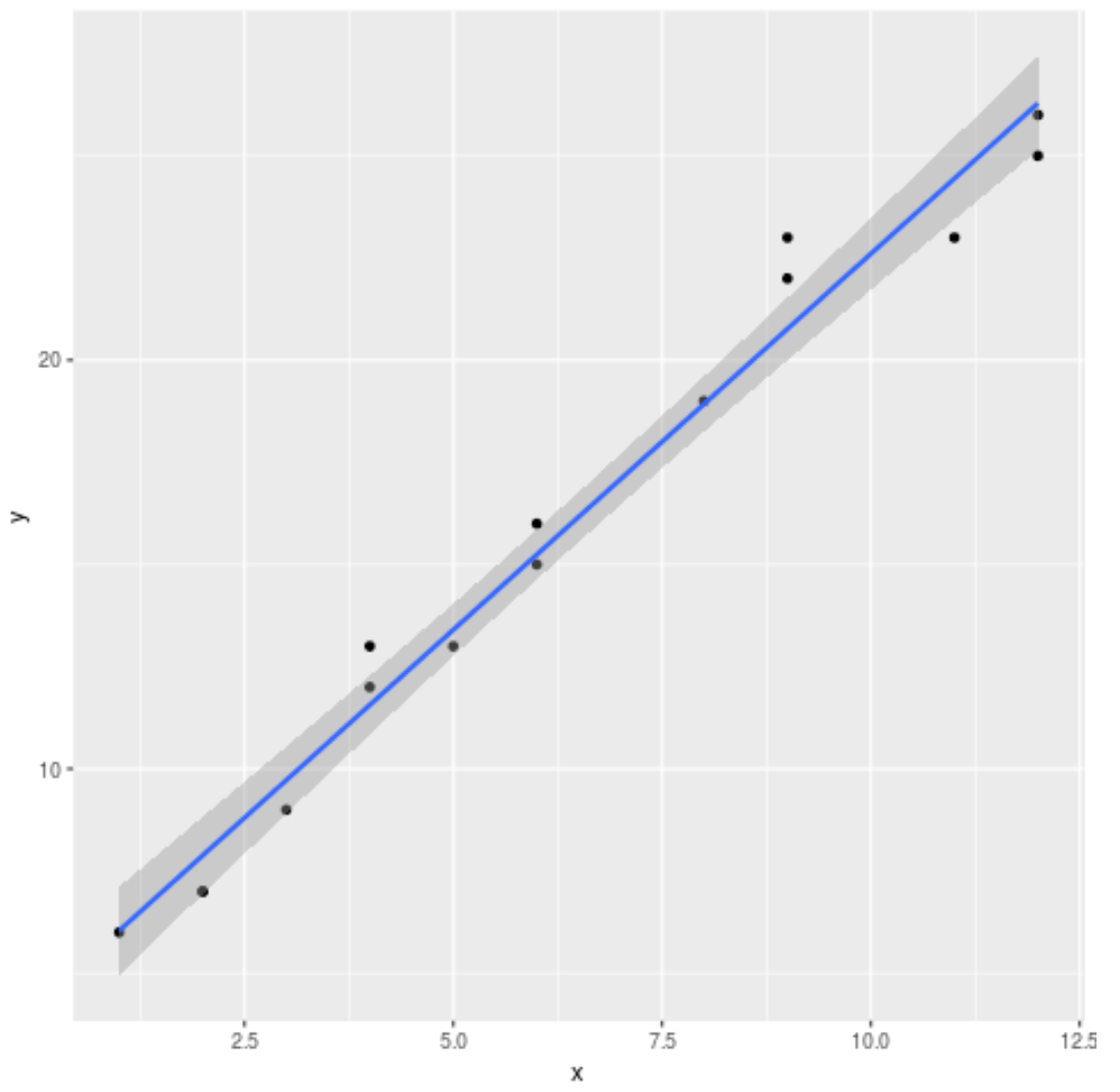
You can use the R visualization library ggplot2 to plot a fitted linear regression model using the following basic syntax:
ggplot(data,aes(x, y)) +
  geom_point() +
  geom_smooth(method='lm')
The following example shows how to use this syntax in practice.
Example: Plot a Linear Regression Line in ggplot2
Suppose we fit a simple linear regression model to the following dataset:
#create dataset
data #fit linear regression model to dataset and view model summary
model |t|)
(Intercept)  4.20041    0.56730   7.404 5.16e-06 ***
x            1.84036    0.07857  23.423 5.13e-12 ***
---
Signif. codes:  0 '***' 0.001 '**' 0.01 '*' 0.05 '.' 0.1 ' ' 1

Residual standard error: 1.091 on 13 degrees of freedom
Multiple R-squared:  0.9769,	Adjusted R-squared:  0.9751
F-statistic: 548.7 on 1 and 13 DF,  p-value: 5.13e-12
The following code shows how to visualize the fitted linear regression model:
library(ggplot2)

#create plot to visualize fitted linear regression model
ggplot(data,aes(x, y)) +
  geom_point() +
  geom_smooth(method='lm')
By default, ggplot2 adds standard error lines to the chart. You can disable these by using the argument se=FALSE as follows:
library(ggplot2)

#create regression plot with no standard error lines
ggplot(data,aes(x, y)) +
  geom_point() +
  geom_smooth(method='lm', se=FALSE)
Lastly, we can customize some aspects of the chart to make it more visually appealing:
library(ggplot2)

#create regression plot with customized style
ggplot(data,aes(x, y)) +
  geom_point() +
  geom_smooth(method='lm', se=FALSE, color='turquoise4') +
  theme_minimal() +
  labs(x='X Values', y='Y Values', title='Linear Regression Plot') +
  theme(plot.title = element_text(hjust=0.5, size=20, face='bold'))
Refer to this post for a complete guide to the best ggplot2 themes.
Additional Resources
An Introduction to Multiple Linear Regression in R
How to Plot a Confidence Interval in R


