You can use the following basic syntax to plot two lines in one graph using ggplot2:
ggplot(df, aes(x = x_variable)) +
  geom_line(aes(y = line1, color = 'line1')) +
  geom_line(aes(y = line2, color = 'line2'))
The following examples show how to use this syntax in practice.
Example 1: Basic Plot with Two Lines in ggplot2
Suppose we have the following data frame in R:
#create data frame
df frame(day = c(1, 2, 3, 4, 5, 6, 7, 8, 9, 10),
                 sales = c(8, 8, 7, 6, 7, 8, 9, 12, 14, 18),
                 customers = c(4, 6, 6, 4, 6, 7, 8, 9, 12, 13))

#view first six rows of data frame
head(df)

  day sales customers
1   1     8         4
2   2     8         6
3   3     7         6
4   4     6         4
5   5     7         6
6   6     8         7
The following code shows how to create a basic plot in ggplot2 with two lines to represent the total sales and customers during this 10-day period:
library(ggplot2)

#create plot with two lines
ggplot(df, aes(x = day)) +
  geom_line(aes(y = sales, color = 'sales')) +
  geom_line(aes(y = customers, color = 'customers'))
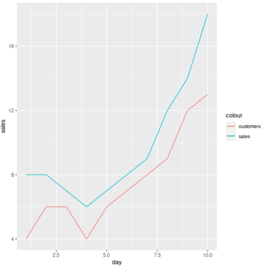
The x-axis displays the day and the y-axis displays the values for the sales and the customers each day.
Example 2: Custom Plot with Two Lines in ggplot2
The following code shows how to create the same plot as the previous example with a custom title, labels, colors, line thickness, and theme:
library(ggplot2)

ggplot(df, aes(x = day)) +
  geom_line(aes(y = sales, color = 'sales'), lwd=2) +
  geom_line(aes(y = customers, color = 'customers'), lwd=2) +
  scale_color_manual('Metric', values=c('red', 'steelblue')) +
  labs(title = 'Sales & Customers by Day', x = 'Day', y = 'Amount') +
  theme_minimal()
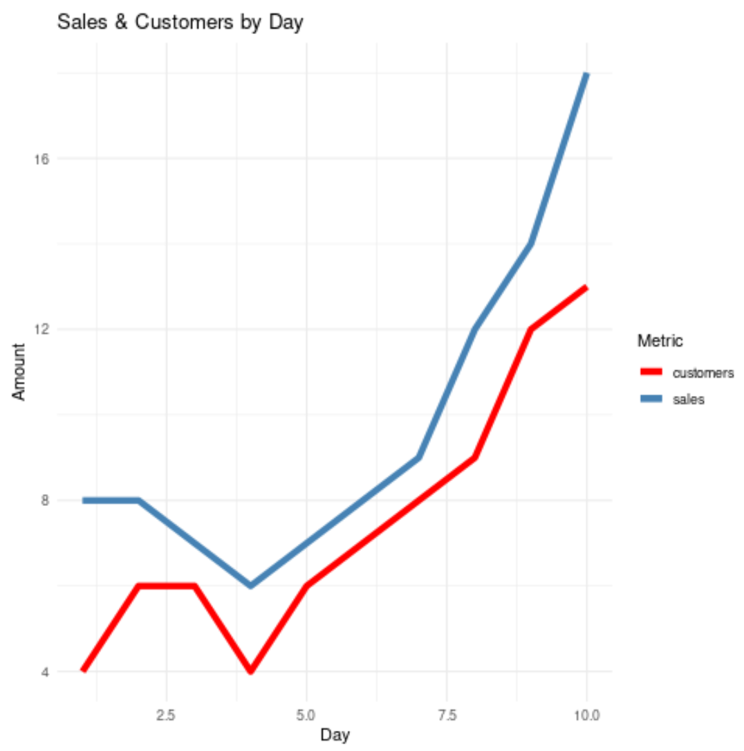
Note that we chose to use theme_minimal() for this plot, but there are a variety of themes you can use for your plot. Refer to this guide for a complete list of ggplot2 themes.
Additional Resources
The following tutorials explain how to perform other common plotting functions with lines in ggplot2:
How to Change the Legend Title in ggplot2
How to Add a Horizontal Line to a Plot Using ggplot2
How to Adjust Line Thickness in ggplot2