You can use the following basic syntax to draw a trend line on a plot in ggplot2:
ggplot(df, aes(x=xvar, y=yvar)) +
    geom_point() +
    geom_smooth(method=lm) #add linear trend line
The following examples show how to use this syntax in practice with the following data frame:
#create data frame
df frame(x=c(1, 2, 3, 3, 5, 7, 9),
                 y=c(8, 14, 18, 25, 29, 33, 25))

#view data frame
df

  x  y
1 1  8
2 2 14
3 3 18
4 3 25
5 5 29
6 7 33
7 9 25
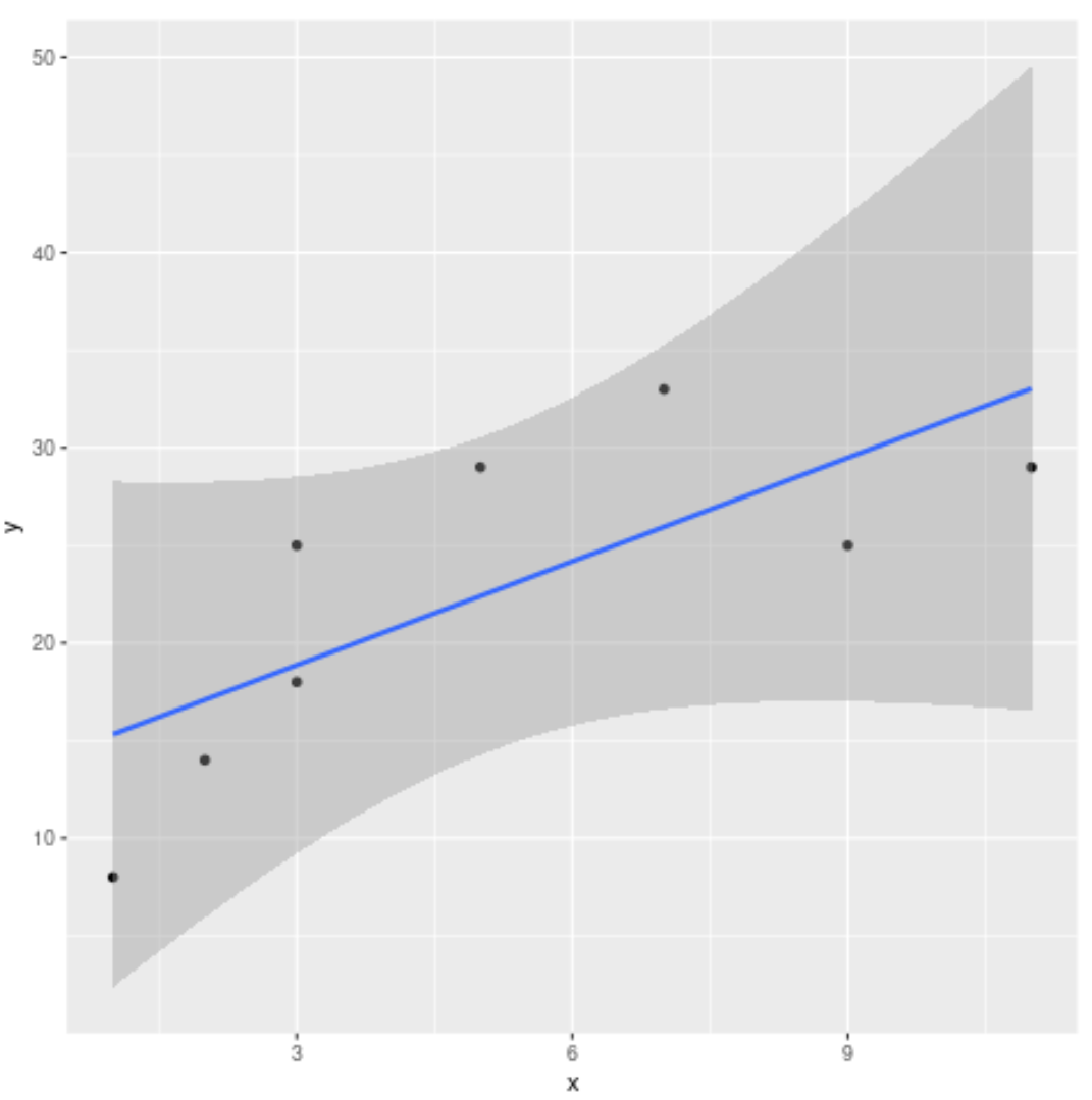
Example 1: Add Linear Trend Line
The following code shows how to add a linear trend line to a scatterplot in ggplot2:
library(ggplot2)

ggplot(df, aes(x=x, y=y)) +
    geom_point() +
    geom_smooth(method=lm) #add linear trend line

Example 2: Add Linear Trend Line & Specify Confidence Region
We can use the level argument to specify the confidence level to use for the shaded confidence region in the plot:
library(ggplot2)

ggplot(df, aes(x=x, y=y)) +
    geom_point() +
    geom_smooth(method=lm, level=0.99)
Note that the default confidence level is 0.95. By specifying a confidence level of 0.99, our shaded confidence region on the plot became even wider.
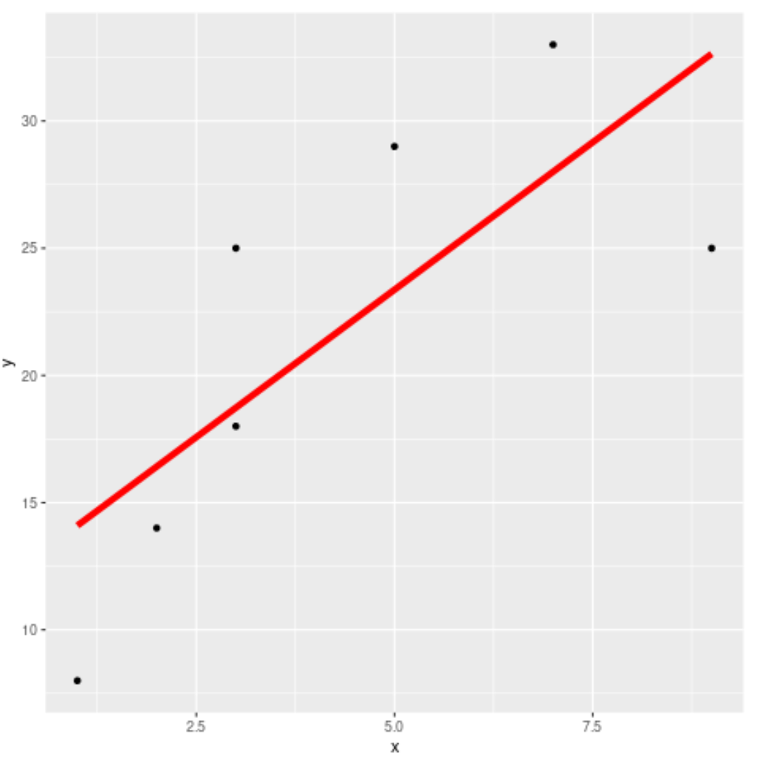
Example 3: Add Linear Trend Line & No Confidence Region
We can use the se=FALSE argument to hide the shaded confidence region around the trend line:
library(ggplot2)

ggplot(df, aes(x=x, y=y)) +
    geom_point() +
    geom_smooth(method=lm, se=FALSE, col='red', size=2)
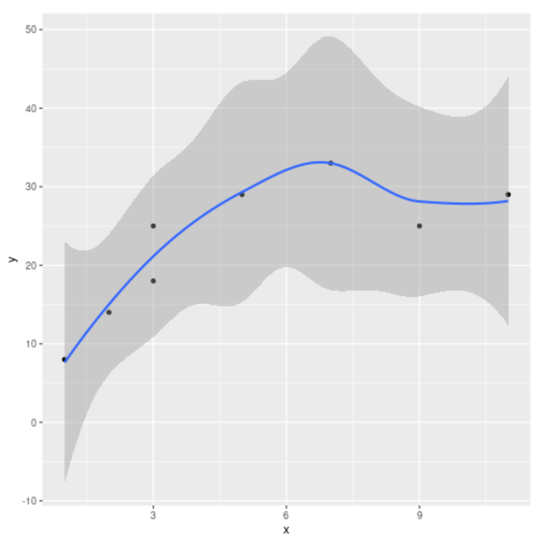
Example 4: Add Curved Trend Line
If we don’t specify a method to use for geom_smooth(), a curved loess line will be used by default:
library(ggplot2)

ggplot(df, aes(x=x, y=y)) +
    geom_point() +
    geom_smooth()
You can find the complete online documentation for the geom_smooth() function here.
Additional Resources
The following tutorials explain how to perform other commonly used operations in ggplot2:
How to Adjust Line Thickness in ggplot2
How to Set Axis Limits in ggplot2
How to Remove Gridlines in ggplot2
How to Change Background Color in ggplot2