You can use the following basic syntax to create a plot in ggplot2 using multiple data frames:
library(ggplot2)

ggplot() +
  geom_line(data=df1, aes(x=x_var, y=y_var), color='blue') +
  geom_line(data=df2, aes(x=x_var, y=y_var), color='red')
This particular example plots multiple lines in a single plot in ggplot2 using data from two different data frames.
By specifying the data frame names at the geom() level, we’re able to include data from multiple data frames in a single plot.
The following example shows how to use this syntax in practice.
Example: Create Plot in ggplot2 Using Multiple Data Frames
Suppose we have the following two data frames in R that contain information on the total sales made at two different stores on various days:
#create first data frame
df1 frame(day=1:8,
                  sales=c(6, 8, 9, 14, 13, 13, 7, 10))

df1

  day sales
1   1     6
2   2     8
3   3     9
4   4    14
5   5    13
6   6    13
7   7     7
8   8    10

#create second data frame
df2 frame(day=1:8,
                  sales=c(2, 3, 3, 5, 7, 6, 5, 9))

df2

  day sales
1   1     2
2   2     3
3   3     3
4   4     5
5   5     7
6   6     6
7   7     5
8   8     9
We can use the following syntax to create a plot in ggplot2 that contains multiple lines to represent the sales from the stores in both data frames:
library(ggplot2)

#create line plot using multiple data frames
ggplot() +
  geom_line(data=df1, aes(x=day, y=sales), color='steelblue') +
  geom_line(data=df2, aes(x=day, y=sales), color='coral2')
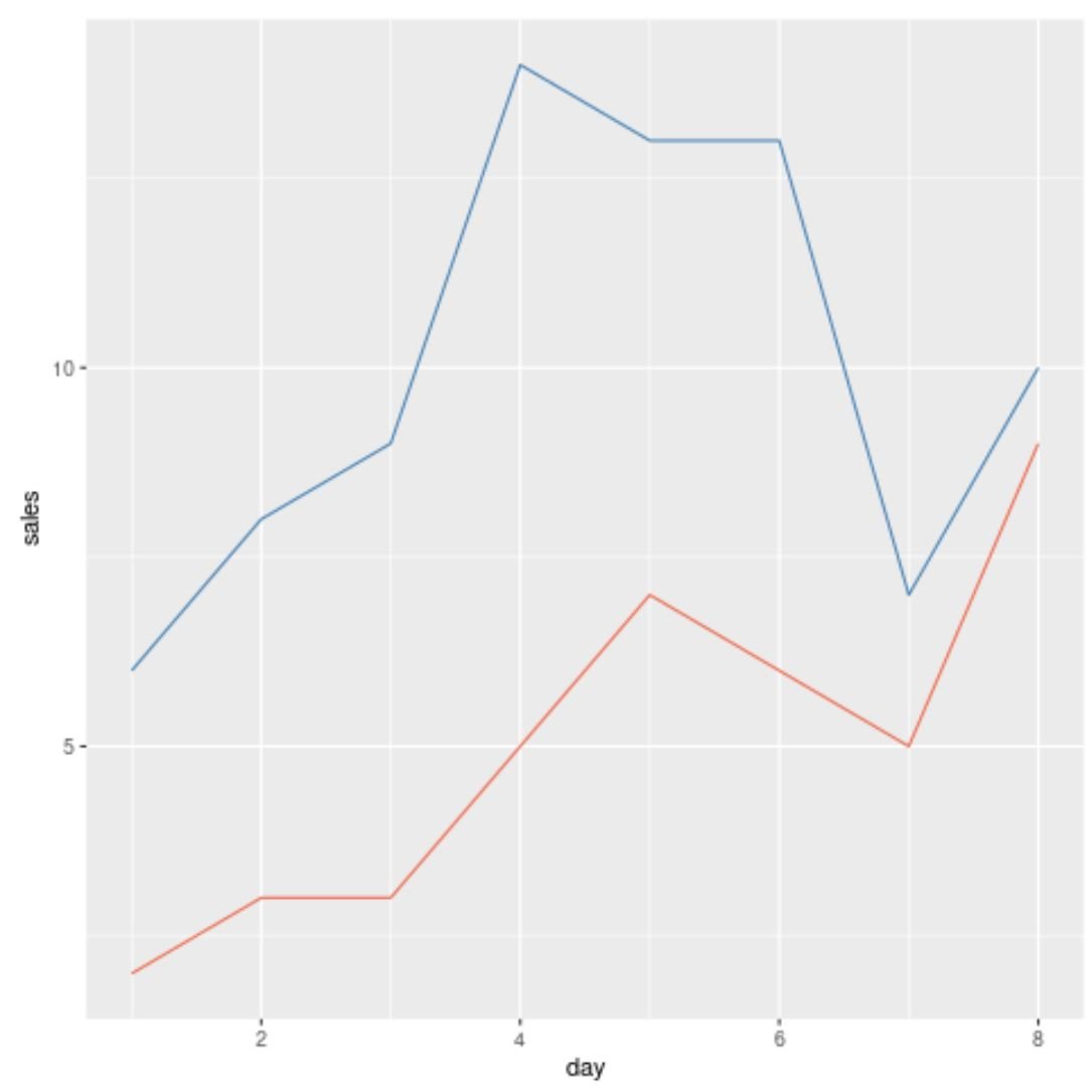
The blue line represents the values from the data frame called df1 and the red line represents the values from the data frame called df2.
Note that this method also works with other geom() functions.
For example, we could create the following scatter plot to display the sales by store from each data frame:
library(ggplot2)

#create scatter plot using multiple data frames
ggplot() +
  geom_point(data=df1, aes(x=day, y=sales), color='steelblue') +
  geom_point(data=df2, aes(x=day, y=sales), color='coral2')
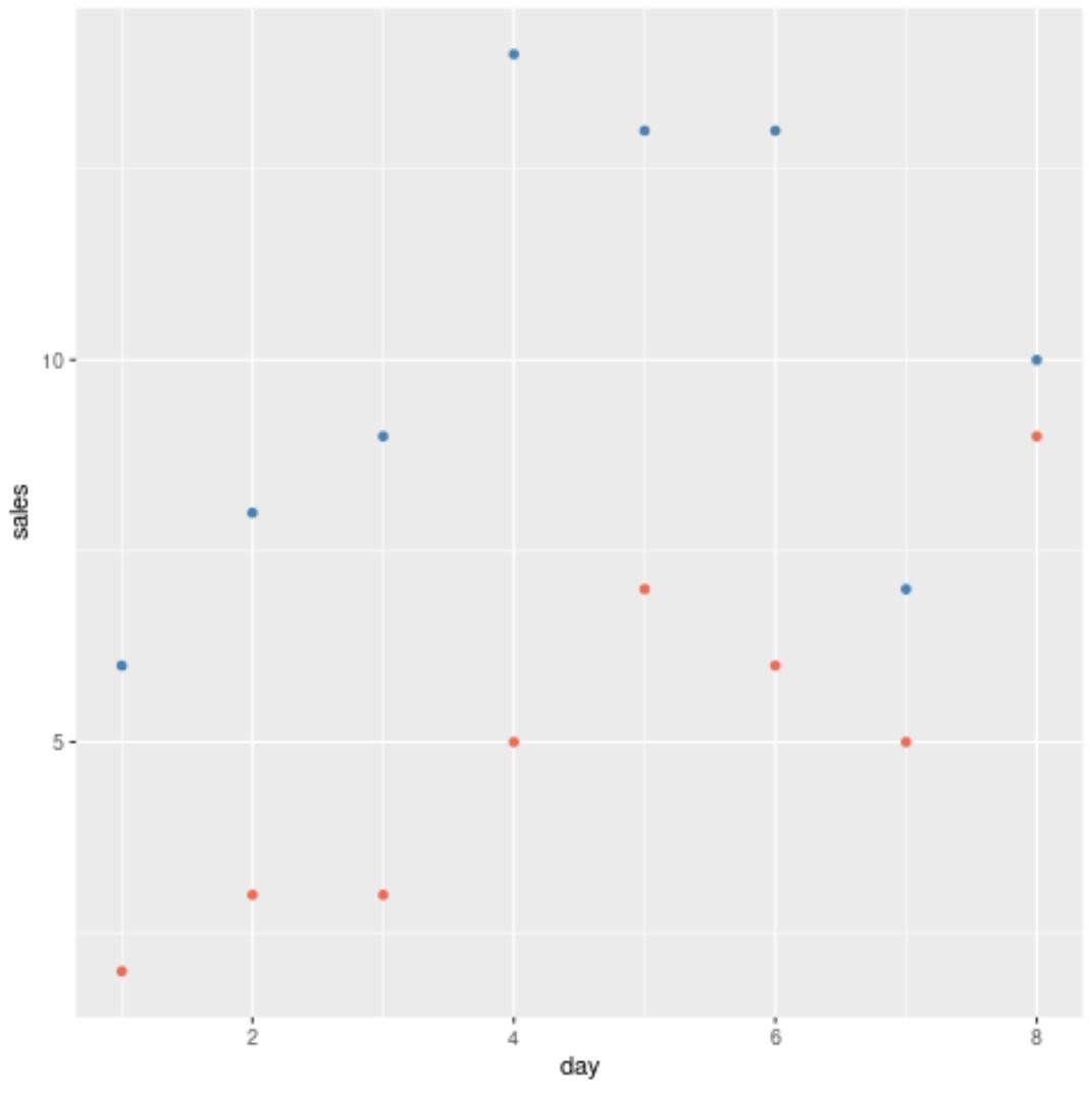
The blue points represent the values from the data frame called df1 and the red points represent the values from the data frame called df2.
Additional Resources
The following tutorials explain how to perform other common tasks in ggplot2:
How to Plot Multiple Lines in ggplot2
How to Change Legend Labels in ggplot2
How to Change X-Axis Labels in ggplot2