You can use the as_labeller() function to change facet axis labels in ggplot2:
ggplot(df, aes(x, y)) +
  geom_point() +
  facet_wrap(.~group,
             strip.position = 'left',
             labeller = as_labeller(c(A='new1', B='new2', C='new3', D='new4'))) +
  ylab(NULL) +
  theme(strip.background = element_blank(),
        strip.placement='outside')
This particular example replaces the following old labels:
- A, B, C, D
with the following new labels:
- new1, new2, new3, new4
The following example shows how to use this syntax in practice.
Example: Change Facet Axis Labels in ggplot2
Suppose we have the following data frame in R:
#create data frame
df frame(team=c('A', 'A', 'B', 'B', 'C', 'C', 'D', 'D'),
                 points=c(8, 14, 20, 22, 25, 29, 30, 31),
                 assists=c(10, 5, 5, 3, 8, 6, 9, 12))

#view data frame
df

  team points assists
1    A      8      10
2    A     14       5
3    B     20       5
4    B     22       3
5    C     25       8
6    C     29       6
7    D     30       9
8    D     31      12
The following code shows how to use facet_wrap() to create a grid that displays a scatterplot of assists vs. points for each team:
library(ggplot2)

#create multiple scatter plots using facet_wrap
ggplot(df, aes(assists, points)) +
  geom_point() +
  facet_wrap(.~team, nrow=4)
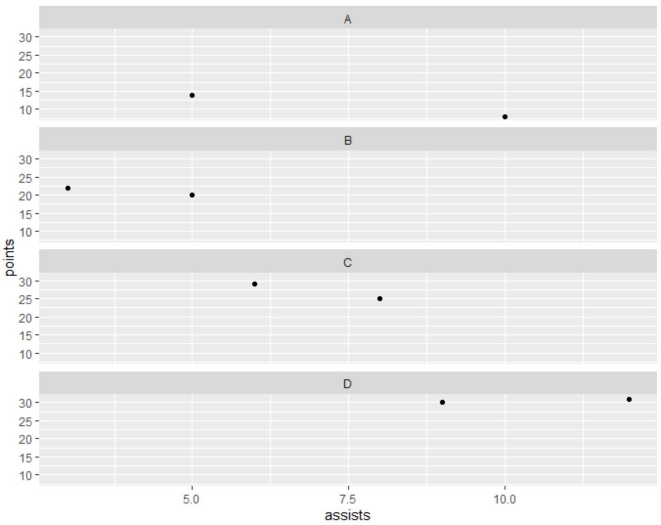
Currently the facets have the following labels: A, B, C, D.
However, we can use the following code to change the labels to team A, team B, team C, and team D:
library(ggplot2)

#create multiple scatter plots using facet_wrap with custom facet labels
ggplot(df, aes(assists, points)) +
  geom_point() +
  facet_wrap(.~team, nrow=4,
             strip.position = 'left',
             labeller = as_labeller(c(A='team A',
                                      B='team B',
                                      C='team C',
                                      D='team D'))) +
  ylab(NULL) +
  theme(strip.background = element_blank(),
        strip.placement='outside')
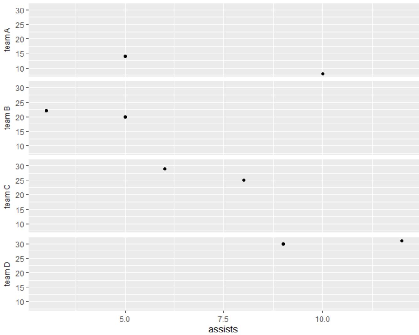
Notice that the facet labels have been changed to team A, team B, team C, and team D and they have been moved to the left side of the plot.
Note: The strip.background argument removes the grey background behind the facet labels and the strip.placement argument specifies that the labels should be placed outside of the axis ticks.
Additional Resources
The following tutorials explain how to perform other common tasks in ggplot2:
How to Change the Order of Facets in ggplot2
How to Change Font Size in ggplot2
How to Rotate Axis Labels in ggplot2