You can use the following basic syntax to change the color of bars in a stacked bar chart in ggplot2:
#create stacked bar chart
ggplot(df, aes(x=x_var, y=y_var, fill=fill_var)) +
  geom_bar(position='stack', stat='identity') +
  scale_fill_manual(values=c('red', 'purple', 'pink', ...))
The following example shows how to use this syntax in practice.
Example: Change Color of Bars in Stacked Bar Chart in ggplot2
Suppose we have the following data frame in R that shows the points scored by various basketball players:
#create data frame
df frame(team=c('A', 'A', 'A', 'B', 'B', 'B', 'C', 'C', 'C'),
                 position=c('G', 'F', 'C', 'G', 'F', 'C', 'G', 'F', 'C'),
                 points=c(22, 12, 10, 30, 12, 17, 28, 23, 20))

#view data frame
df

  team position points
1    A        G     22
2    A        F     12
3    A        C     10
4    B        G     30
5    B        F     12
6    B        C     17
7    C        G     28
8    C        F     23
9    C        C     20
If we create a stacked bar chart to visualize the points scored by players on each team, ggplot2 will use a set of default colors to fill in the bars:
library(ggplot2)

#create stacked bar chart
ggplot(df, aes(x=team, y=points, fill=position)) +
  geom_bar(position='stack', stat='identity')

However, we can use the scale_fill_manual() argument to specify the exact colors that ggplot2 should use for the bars:
library(ggplot2)

#create stacked bar chart with custom colors
ggplot(df, aes(x=team, y=points, fill=position)) +
  geom_bar(position='stack', stat='identity') +
  scale_fill_manual(values=c('red', 'purple', 'pink'))

The bars now have the exact colors (in order from top to bottom) that we specified within the scale_fill_manual() function.
Also note that we can use hex color codes within the scale_fill_manual() function:
library(ggplot2)

#create stacked bar chart with custom hex color codes
ggplot(df, aes(x=team, y=points, fill=position)) +
  geom_bar(position='stack', stat='identity') +
  scale_fill_manual(values=c('#2596BE', '#8225BE', '#D4C443'))
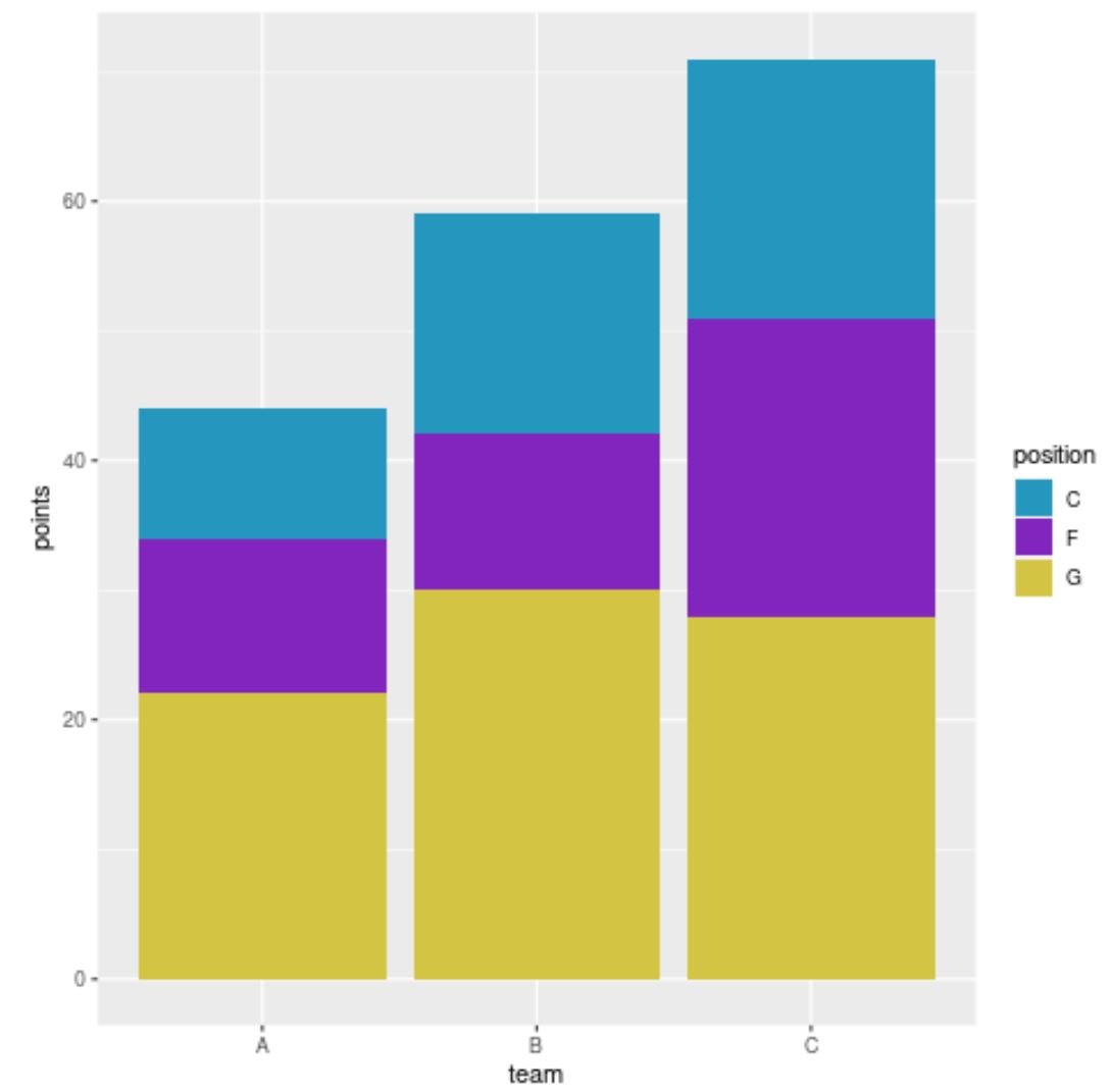
The bars now have the hex color codes that we specified.
Additional Resources
The following tutorials explain how to perform other common tasks in ggplot2:
How to Reorder Bars in a Stacked Bar Chart in ggplot2
How to Create a Barplot in ggplot2 with Multiple Variables
How to Order the Bars in a ggplot2 Bar Chart