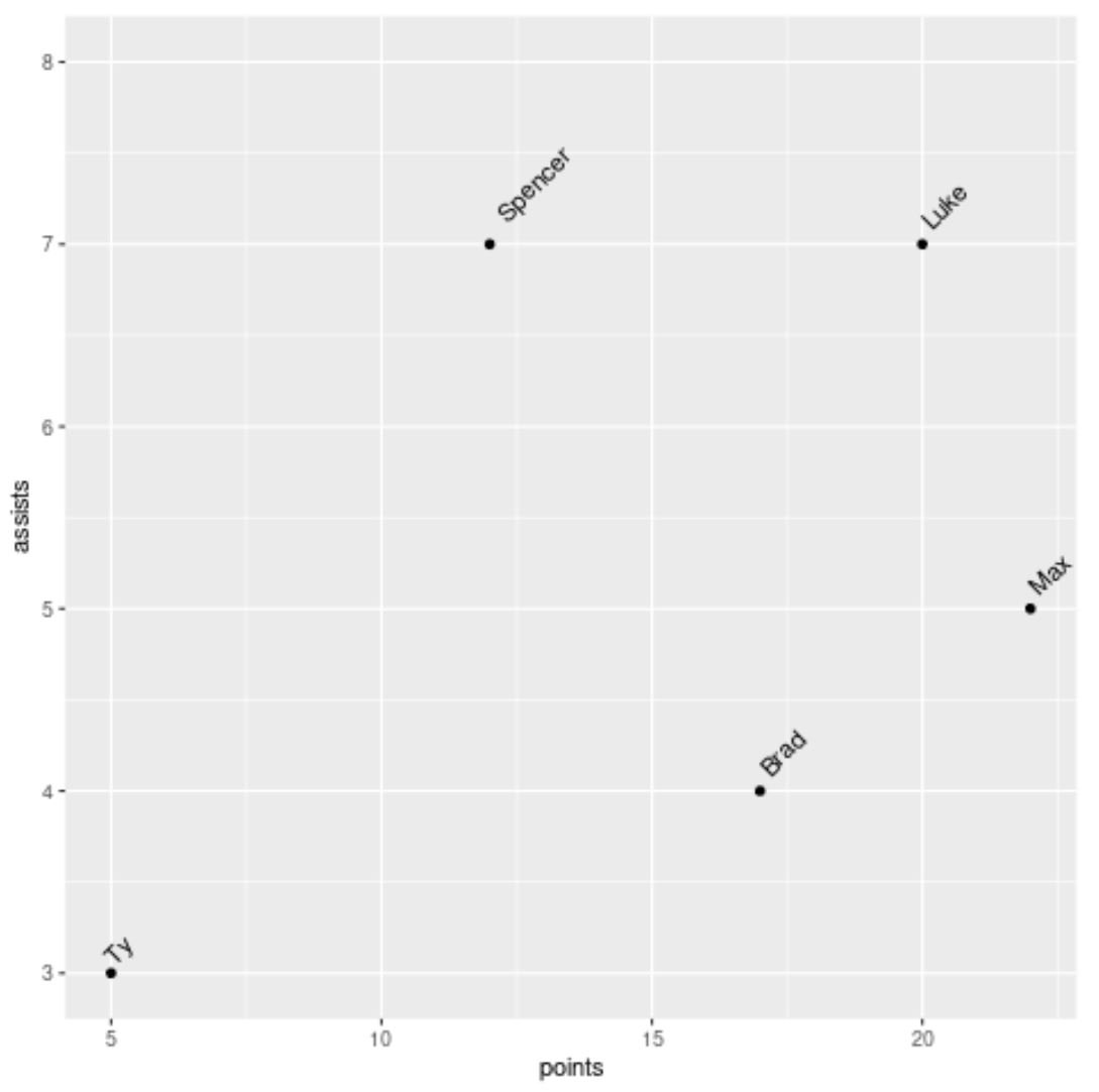
You can use the following basic syntax to rotate annotated text in plots in ggplot2:
ggplot(df) +
  geom_point(aes(x=x, y=y)) +
  geom_text(aes(x=x, y=y, label=group), hjust=-0.3, vjust=-0.1, angle=45)
In this particular example we use the angle argument to rotate the annotated text 45 degrees counterclockwise and the hjust and vjust arguments to increase the horizontal and vertical distance of the text from the points in the plot.
The following example shows how to use this syntax in practice.
Example: Rotate Annotated Text in ggplot2
Suppose we have the following dataset in R:
#create data frame
df frame(player=c('Brad', 'Ty', 'Spencer', 'Luke', 'Max'),
                 points=c(17, 5, 12, 20, 22),
                 assists=c(4, 3, 7, 7, 5))

#view data frame
df

   player points assists
1    Brad     17       4
2      Ty      5       3
3 Spencer     12       7
4    Luke     20       7
5     Max     22       5
Now suppose we create the following scatter plot in ggplot2 to visualize this data:
library(ggplot2)

#create scatter plot with annotated labels
ggplot(df) +
  geom_point(aes(x=points, y=assists)) +
  geom_text(aes(x=points, y=assists, label=player))
Notice that the labels are horizontal and located directly on top of the points.
We can use the following syntax to rotate the labels and move them slightly further from the points to make them easier to read:
library(ggplot2)

#create scatter plot with annotated rotated labels
ggplot(df) +
  geom_point(aes(x=points, y=assists)) +
  geom_text(aes(x=points, y=assists, label=player), hjust=-.3, vjust=-.1, angle=45) +
  ylim(3, 8)
Notice that the labels are now all rotated 45 degrees counterclockwise.
Feel free to play around with the hjust, vjust, and angle arguments to get your annotated text in whatever position you’d like on the plot.
Note: We also used the ylim argument to increase the y-axis limits on the plot so the label “Spencer” at the top of the plot wasn’t cut off.
Additional Resources
The following tutorials explain how to perform other common tasks in R:
How to Rotate Axis Labels in ggplot2
How to Change Point Size in ggplot2
How to Add Text to ggplot2 Plots


