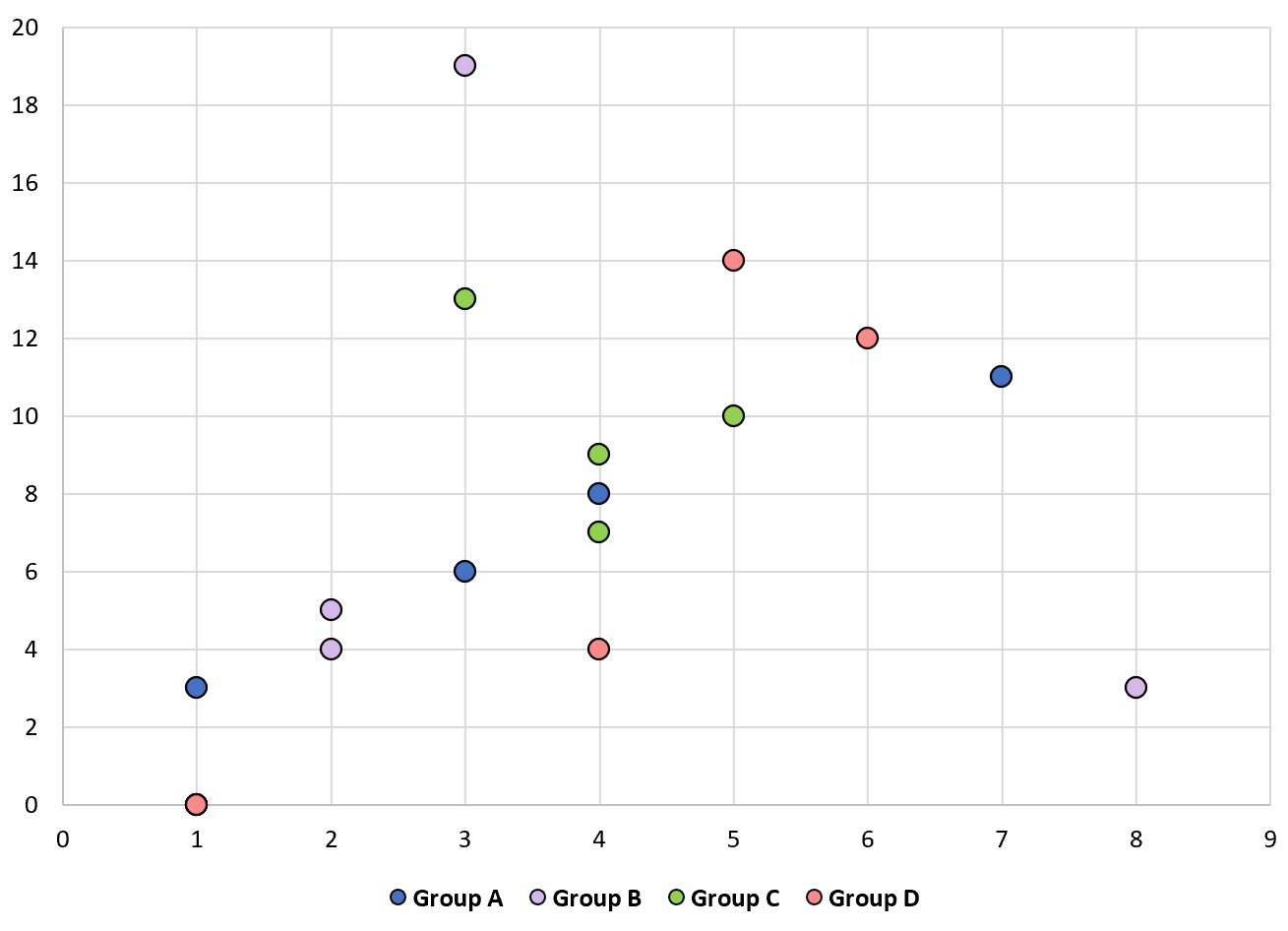
Often you may want to create a scatterplot with multiple series in Excel, similar to the plot below:
Fortunately this is fairly easy to do in Excel with some simple formulas. The following step-by-step example shows exactly how to do so.
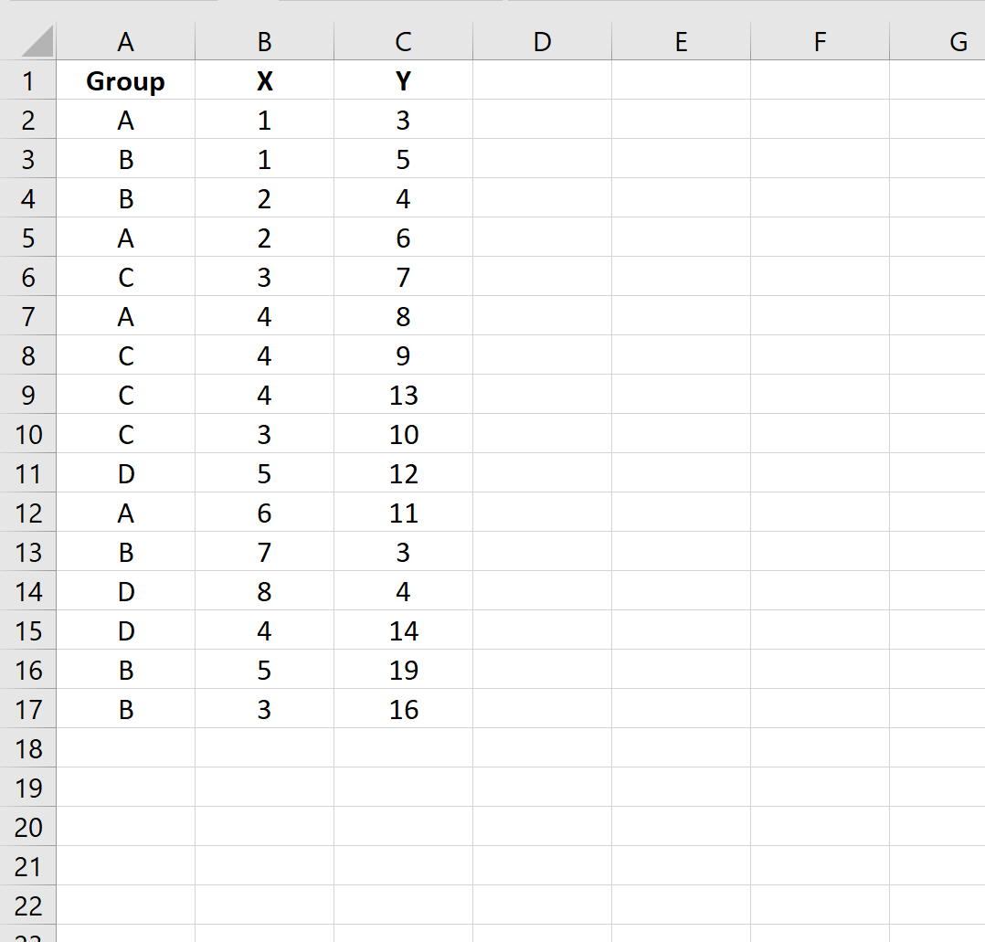
Step 1: Enter the Data
First, let’s enter the following (X, Y) values for four different groups: A, B, C, and D.
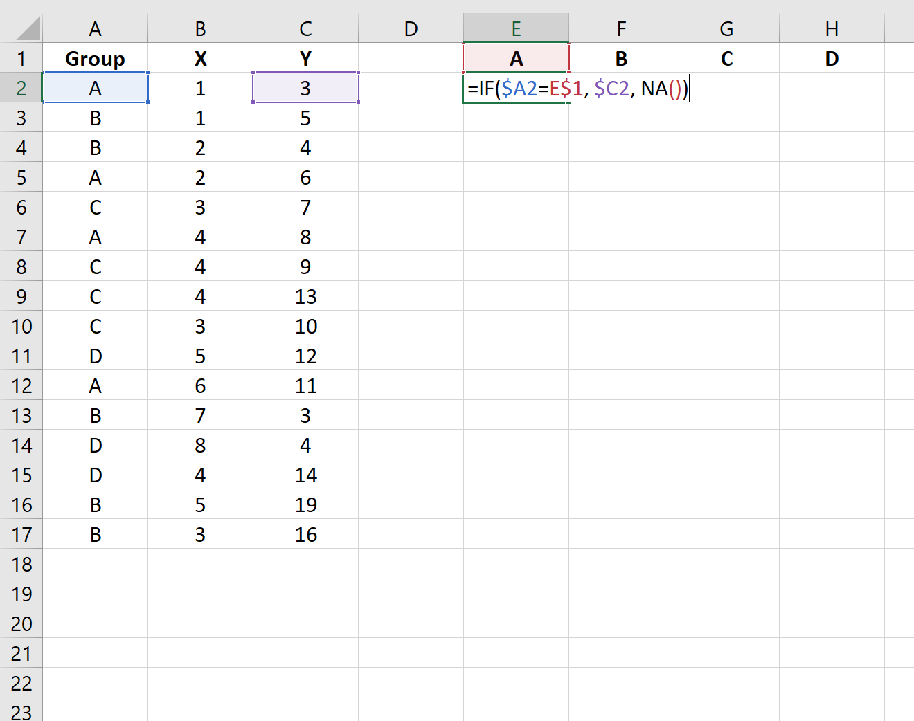
Step 2: Format the Data
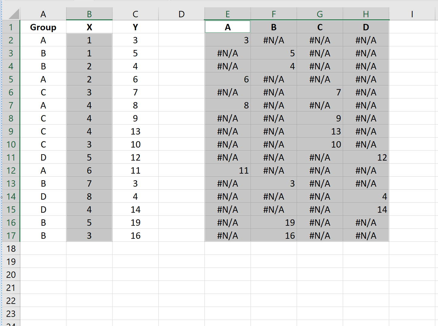
Before we can create a scatterplot to visualize the (X, Y) coordinates for each group, we must first format the data in a specific manner.
First, we’ll enter the unique values for each group along the top row and then type the following formula into cell E2:
=IF($A2=H$1, $C2, NA())
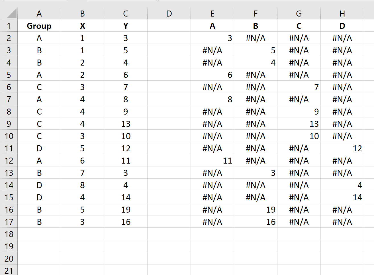
We’ll then drag this formula to every cell to the right of cell E2. We’ll then drag it to every cell below H2 until we end up with the following result:
Step 3: Create the Scatterplot
Next, highlight every value in column B. Then, hold Ctrl and highlight every cell in the range E1:H17.
Along the top ribbon, click the Insert tab and then click Insert Scatter (X, Y) within the Charts group to produce the following scatterplot:
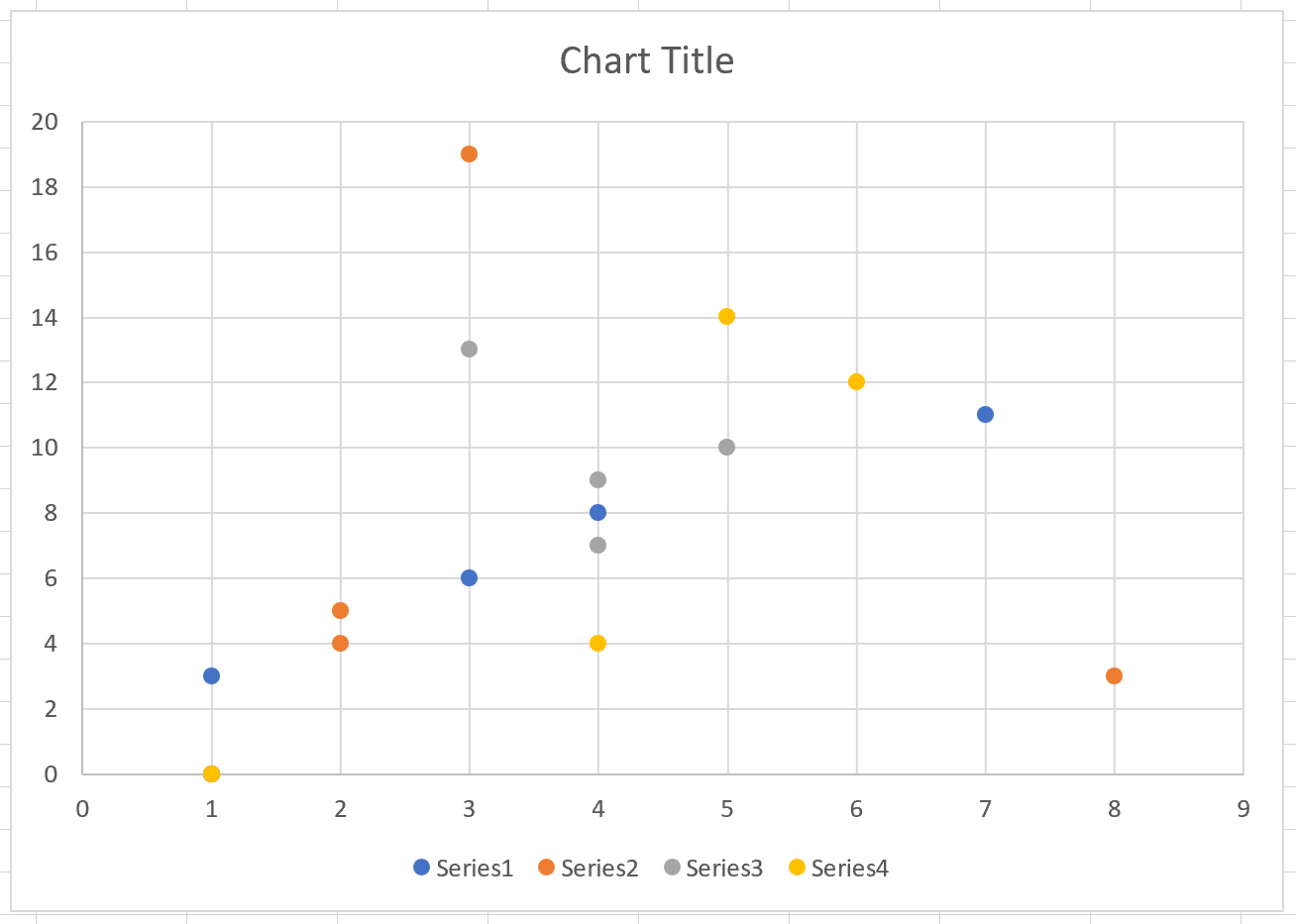
The (X, Y) coordinates for each group are shown, with each group possessing a unique color.
Feel free to modify the colors, point sizes, and labels to make the plot more aesthetically pleasing:
Additional Resources
The following tutorials explain how to perform other common functions with scatterplots in Excel:
How to Add a Regression Line to a Scatterplot in Excel
How to Add a Horizontal Line to a Scatterplot in Excel