Often you may want to connect the points in a scatter plot in Excel.
Fortunately this is easy to do and the following step-by-step example shows how to do so.
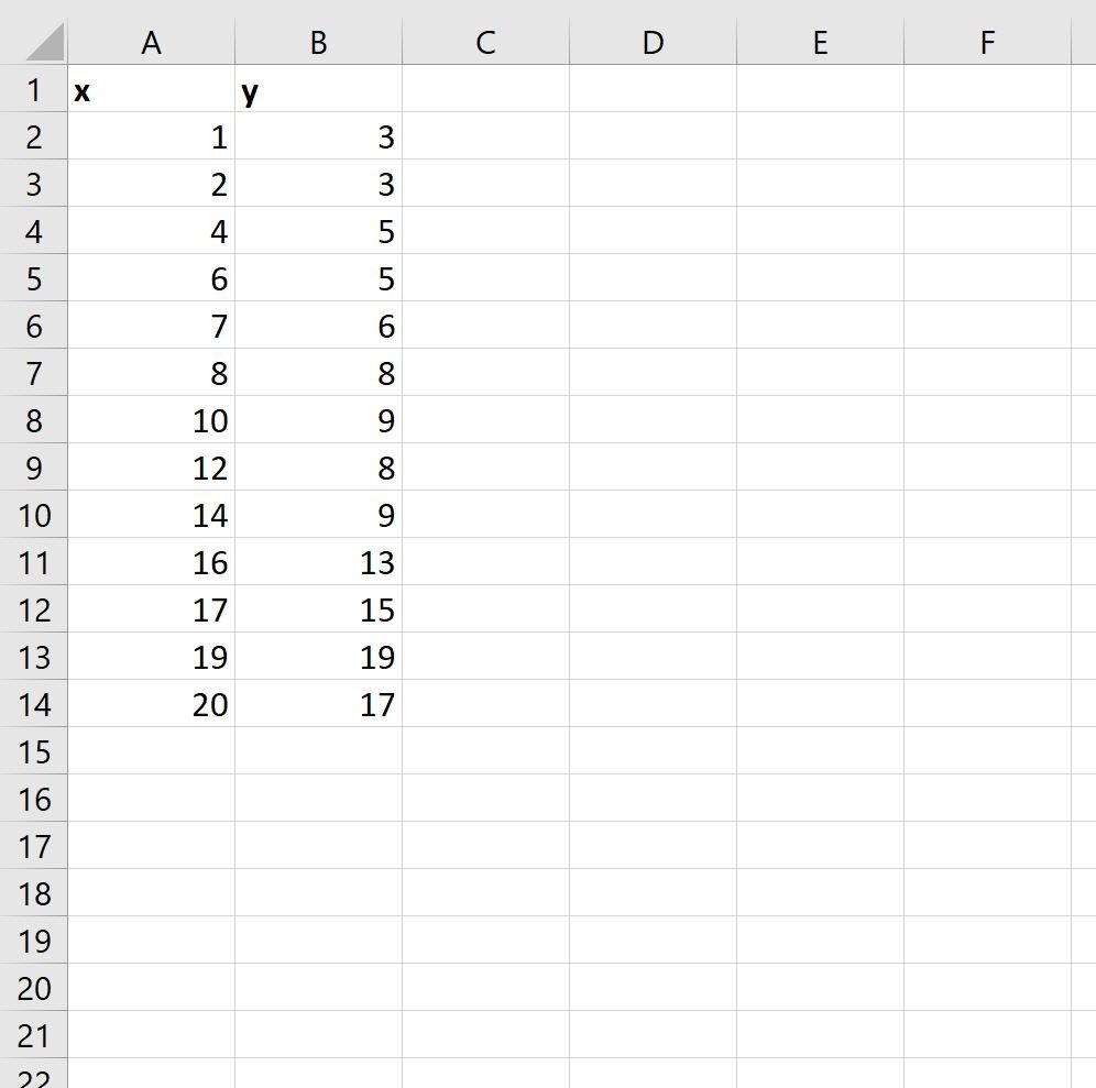
Step 1: Enter the Data
First, let’s enter the following dataset in Excel:
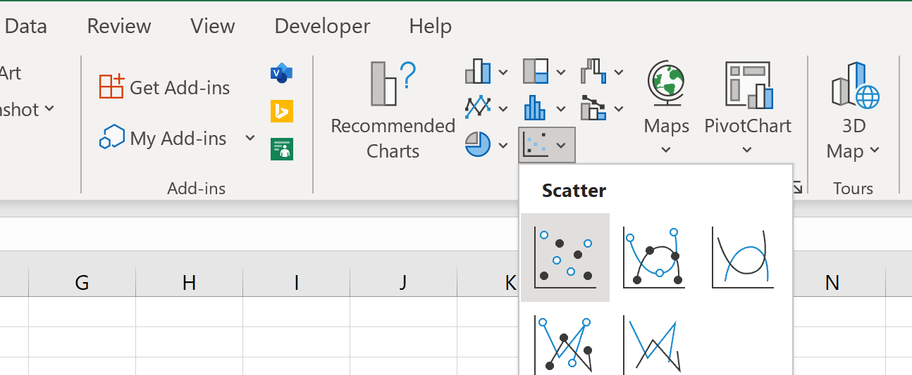
Step 2: Create the Scatter Plot
Next, we will create a scatter plot to visualize the values in the dataset.
To do so, highlight the cells in the range A2:B14, then click the Insert tab along the top ribbon, then click the Scatter icon in the Charts group:
The following scatter plot will automatically be created:
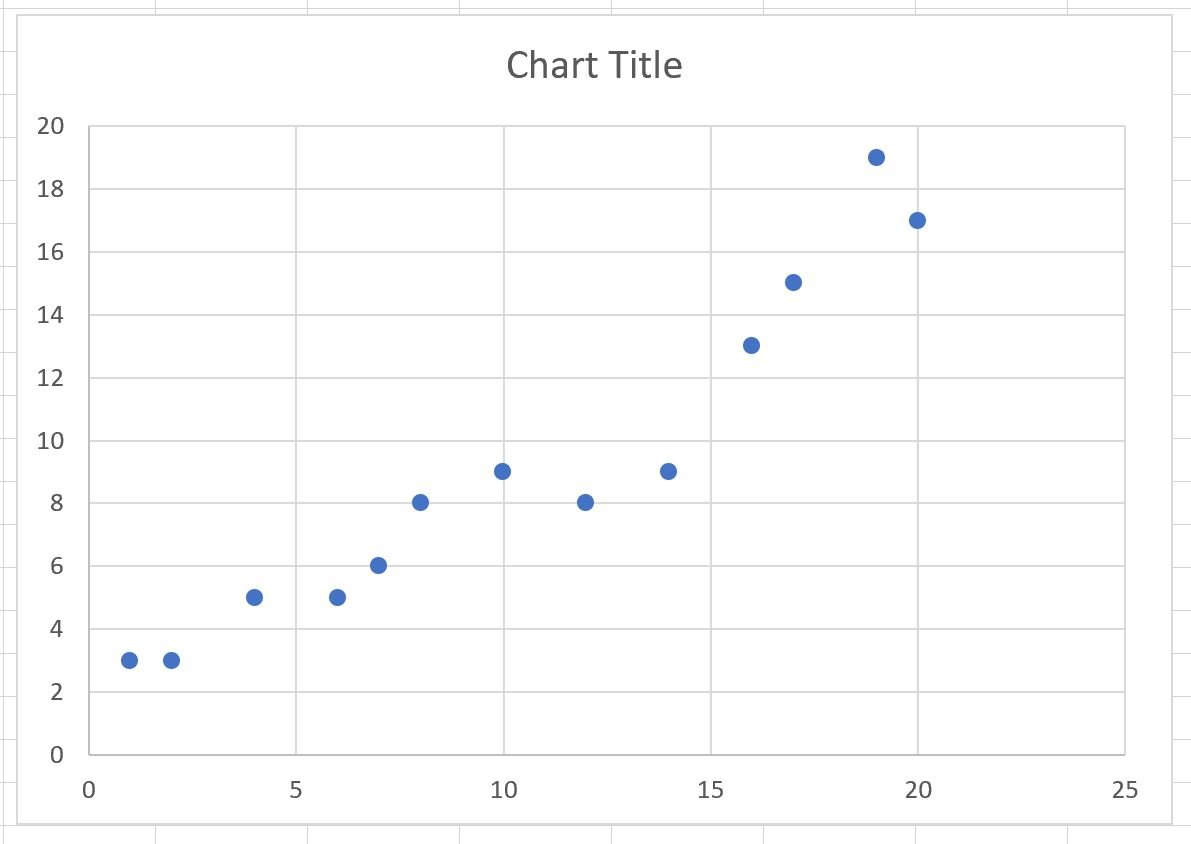
Notice that the points in the plot are not connected by default.
Step 3: Connect the Points in the Scatter Plot
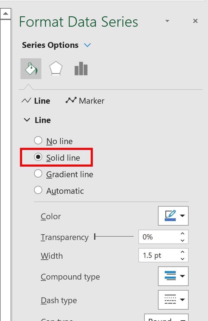
To connect the points in the plot, double click on any individual point in the plot.
In the Format Data Series panel that appears on the right side of the screen, click the paint bucket icon, then click the Line group, then click Solid Line:
The points in the plot will automatically be connected with a line:

Also note that within the Format Data Series panel, you can control the style of the line including:
- Line color
- Line width
- Line dash type
Feel free to modify the appearance of the line to make it look however you’d like.
Additional Resources
The following tutorials explain how to perform other common operations in Excel:
How to Add Labels to Scatterplot Points in Excel
How to Add a Horizontal Line to a Scatterplot in Excel
How to Add a Regression Line to a Scatterplot in Excel