Often you may be interested in adding error bars to charts in Python to capture uncertainty around measurements or calculated values. Fortunately this is easy to do using the matplotlib library.
This tutorial explains how to add error bars to both bar charts and line charts in Python.
Error Bars in Bar Charts
Suppose we have the following dataset of 10 values in Python:
import numpy as np
import matplotlib.pyplot as plt

#define dataset
data = [4, 6, 6, 8, 9, 14, 16, 16, 17, 20]
To create a bar chart with error bars for this dataset, we can define the width of the error bars as the standard error, which is calculated a
Standard error = s / √n
where:
- s: sample standard deviation
- n: sample size
The following code shows how to calculate the standard error for this example:
#calculate standard error
std_error = np.std(data, ddof=1) / np.sqrt(len(data))

#view standard error
std_error

1.78
Lastly, we can create the bar chart using error bars that have a width equal to the standard error:
#define chart
fig, ax = plt.subplots()

#create chart
ax.bar(x=np.arange(len(data)), #x-coordinates of bars
       height=data, #height of bars
       yerr=std_error, #error bar width
       capsize=4) #length of error bar caps
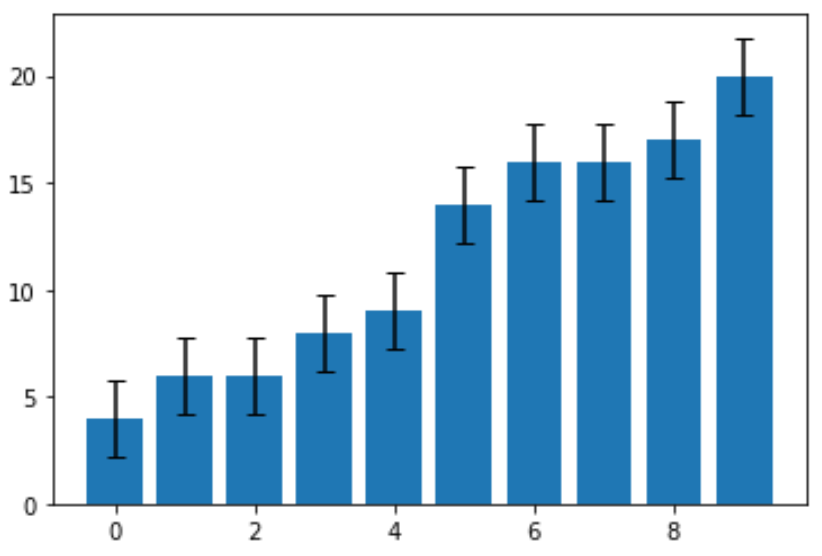
The standard error turned out to be 1.78. This is the width of the error bar that extends in both directions from the point estimates on the graph. For example, the value of the first bar in the chart is 4, thus it has an error bar that extends from:
- Lower end: 4 – 178 = 2.22
- Upper end: 4 + 1.78 = 5.78
Each error bar in the chart is the same width.
Error Bars in Line Charts
The following code shows how to create a line chart with error bars for the same dataset:
import numpy as np
import matplotlib.pyplot as plt

#define data
data = [4, 6, 6, 8, 9, 14, 16, 16, 17, 20]

#define x and y coordinates
x = np.arange(len(data))
y = data

#create line chart with error bars
fig, ax = plt.subplots()

ax.errorbar(x, y,
            yerr=std_error,
            capsize=4)
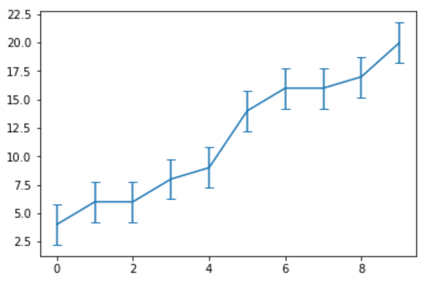
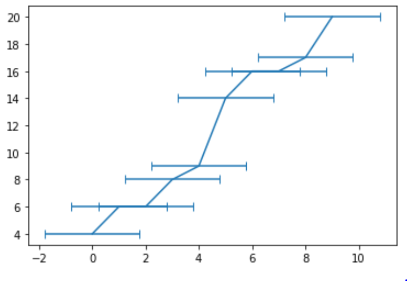
Note that the argument yerr tells Python to create vertical error bars. We could instead use horizontal vertical bars by using the xerr argument:
#create line chart with horizontal error bars
fig, ax = plt.subplots()

ax.errorbar(x, y,
            xerr=std_error,
            capsize=4)
You can find more Python tutorials here.