Often you may want to find the equation that best fits some curve in R.

The following step-by-step example explains how to fit curves to data in R using the poly() function and how to determine which curve fits the data best.
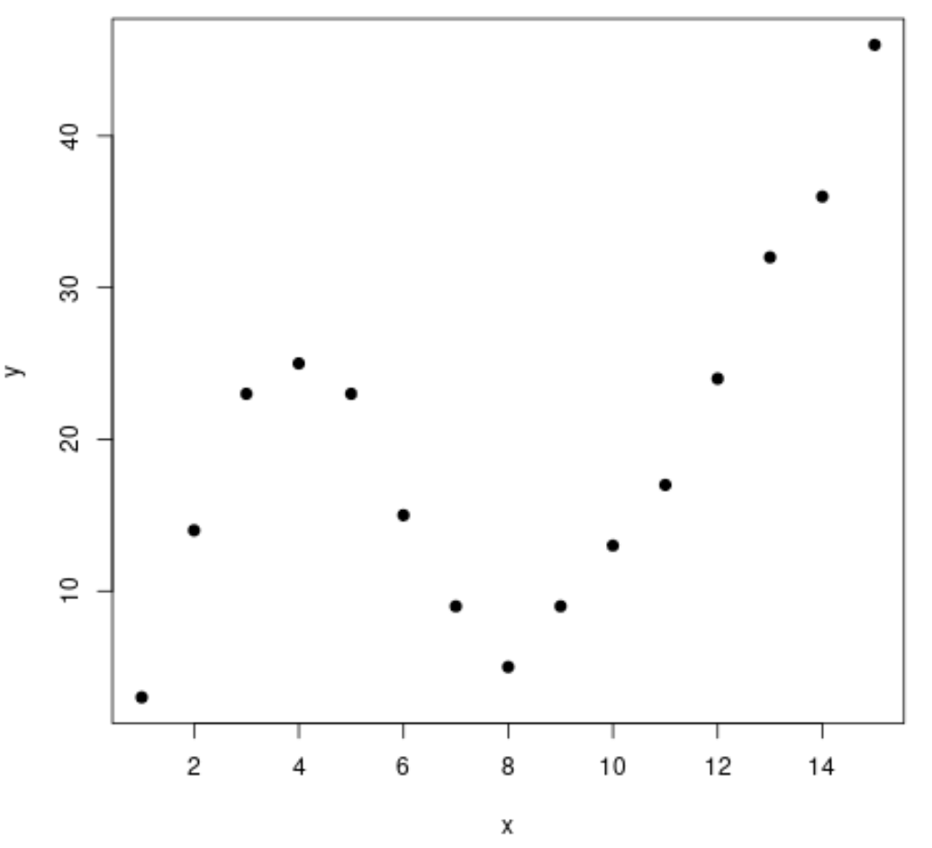
Step 1: Create & Visualize Data
First, let’s create a fake dataset and then create a scatterplot to visualize the data:
#create data frame
df frame(x=1:15,
                 y=c(3, 14, 23, 25, 23, 15, 9, 5, 9, 13, 17, 24, 32, 36, 46))

#create a scatterplot of x vs. y
plot(df$x, df$y, pch=19, xlab='x', ylab='y')
Step 2: Fit Several Curves
Next, let’s fit several polynomial regression models to the data and visualize the curve of each model in the same plot:
#fit polynomial regression models up to degree 5
fit1 TRUE), data=df)
fit3 TRUE), data=df)
fit4 TRUE), data=df)
fit5 TRUE), data=df)

#create a scatterplot of x vs. y
plot(df$x, df$y, pch=19, xlab='x', ylab='y')

#define x-axis values
x_axis 15)

#add curve of each model to plot
lines(x_axis, predict(fit1, data.frame(x=x_axis)), col='green')
lines(x_axis, predict(fit2, data.frame(x=x_axis)), col='red')
lines(x_axis, predict(fit3, data.frame(x=x_axis)), col='purple')
lines(x_axis, predict(fit4, data.frame(x=x_axis)), col='blue')
lines(x_axis, predict(fit5, data.frame(x=x_axis)), col='orange')
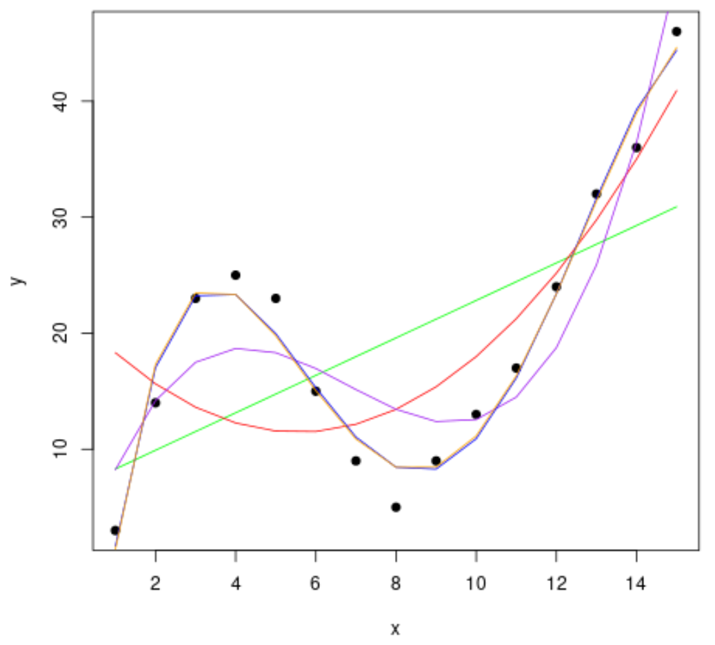
To determine which curve best fits the data, we can look at the adjusted R-squared of each model.
This value tells us the percentage of the variation in the response variable that can be explained by the predictor variable(s) in the model, adjusted for the number of predictor variables.
#calculated adjusted R-squared of each model
summary(fit1)$adj.r.squared
summary(fit2)$adj.r.squared
summary(fit3)$adj.r.squared
summary(fit4)$adj.r.squared
summary(fit5)$adj.r.squared

[1] 0.3144819
[1] 0.5186706
[1] 0.7842864
[1] 0.9590276
[1] 0.9549709
From the output we can see that the model with the highest adjusted R-squared is the fourth-degree polynomial, which has an adjusted R-squared of 0.959.
Step 3: Visualize the Final Curve
Lastly, we can create a scatterplot with the curve of the fourth-degree polynomial model:
#create a scatterplot of x vs. y
plot(df$x, df$y, pch=19, xlab='x', ylab='y')

#define x-axis values
x_axis 15)

#add curve of fourth-degree polynomial model
lines(x_axis, predict(fit4, data.frame(x=x_axis)), col='blue')
We can also get the equation for this line using the summary() function:
summary(fit4)

Call:
lm(formula = y ~ poly(x, 4, raw = TRUE), data = df)

Residuals:
    Min      1Q  Median      3Q     Max
-3.4490 -1.1732  0.6023  1.4899  3.0351

Coefficients:
                         Estimate Std. Error t value Pr(>|t|)
(Intercept)             -26.51615    4.94555  -5.362 0.000318 ***
poly(x, 4, raw = TRUE)1  35.82311    3.98204   8.996 4.15e-06 ***
poly(x, 4, raw = TRUE)2  -8.36486    0.96791  -8.642 5.95e-06 ***
poly(x, 4, raw = TRUE)3   0.70812    0.08954   7.908 1.30e-05 ***
poly(x, 4, raw = TRUE)4  -0.01924    0.00278  -6.922 4.08e-05 ***
---
Signif. codes:  0 ‘***’ 0.001 ‘**’ 0.01 ‘*’ 0.05 ‘.’ 0.1 ‘ ’ 1

Residual standard error: 2.424 on 10 degrees of freedom
Multiple R-squared:  0.9707,	Adjusted R-squared:  0.959
F-statistic: 82.92 on 4 and 10 DF,  p-value: 1.257e-07
The equation of the curve is as follows:
y = -0.0192x4 + 0.7081x3 – 8.3649x2 + 35.823x – 26.516
We can use this equation to predict the value of the response variable based on the predictor variables in the model. For example if x = 4 then we would predict that y = 23.34:
y = -0.0192(4)4 + 0.7081(4)3 – 8.3649(4)2 + 35.823(4) – 26.516 = 23.34
Additional Resources
An Introduction to Polynomial Regression
Polynomial Regression in R (Step-by-Step)
How to Use seq Function in R