Often you may want to assign colors to points in a ggplot2 plot based on some categorical variable.
Fortunately this is easy to do using the following syntax:
ggplot(df, aes(x=x_variable, y=y_variable, color=color_variable)) +
  geom_point()
This tutorial provides several examples of how to use this syntax in practice using the built-in R dataset titled iris:
#view first six rows of iris dataset
head(iris)

  Sepal.Length Sepal.Width Petal.Length Petal.Width Species
1          5.1         3.5          1.4         0.2  setosa
2          4.9         3.0          1.4         0.2  setosa
3          4.7         3.2          1.3         0.2  setosa
4          4.6         3.1          1.5         0.2  setosa
5          5.0         3.6          1.4         0.2  setosa
6          5.4         3.9          1.7         0.4  setosa
Example 1: Use Default Colors
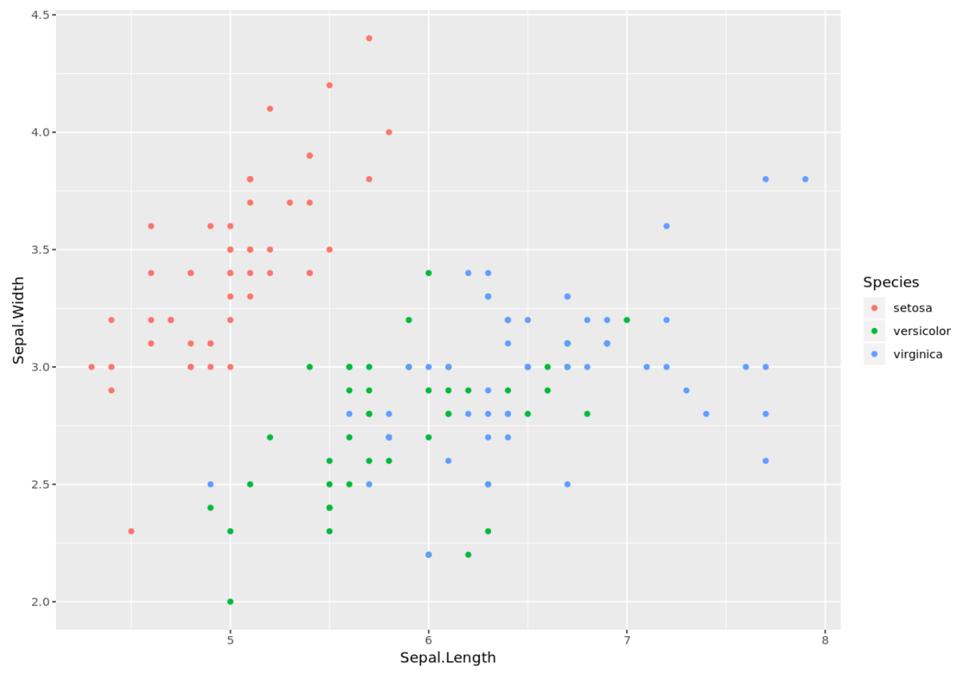
The following code shows how to assign default colors to the points in a ggplot2 plot based on the factor variable Species:
library(ggplot2)

ggplot(iris, aes(x=Sepal.Length, y=Sepal.Width, color=Species)) +
  geom_point()
Since we didn’t specify a color scale or a list of custom colors, ggplot2 simply assigned a list of default red, green, and blue colors to the points.
Example 2: Use Custom Colors
The following code shows how to assign custom colors to the points in a ggplot2 plot by using scale_color_manual():
library(ggplot2)

ggplot(iris, aes(x=Sepal.Length, y=Sepal.Width, color=Species)) +
  geom_point() +
  scale_color_manual(values = c("setosa" = "purple",
                                "versicolor="orange",
                                "virginica"="steelblue"))
Note that we could have used hex color codes as well to specify the colors.
Example 3: Use a Custom Color Scale
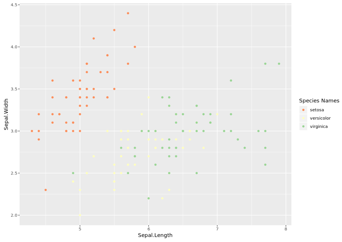
The following code shows how to assign custom colors to the points in a ggplot2 plot by using a custom color scale from the RColorBrewer package:
library(ggplot2)
library(RColorBrewer)

#define custom color scale
myColors pal(3, "Spectral")
names(myColors) Species Names", values = myColors)

ggplot(iris, aes(x=Sepal.Length, y=Sepal.Width, color=Species)) +
  geom_point() +
  custom_colors
Additional Resources
How to Create Side-by-Side Plots in ggplot2
How to Change the Legend Title in ggplot2
A Complete Guide to the Best ggplot2 Themes


