A histogram is a plot that can be used to quickly visualize the distribution of values in a dataset.
This tutorial provides a step-by-step example of how to create a histogram in Excel and how to modify the bin width so that the histogram looks exactly how you’d like.
Step 1: Create the Data
First, we’ll create the following dataset that shows the annual income of 26 different people:
Step 2: Create the Histogram
Next, we’ll highlight the two columns of data:
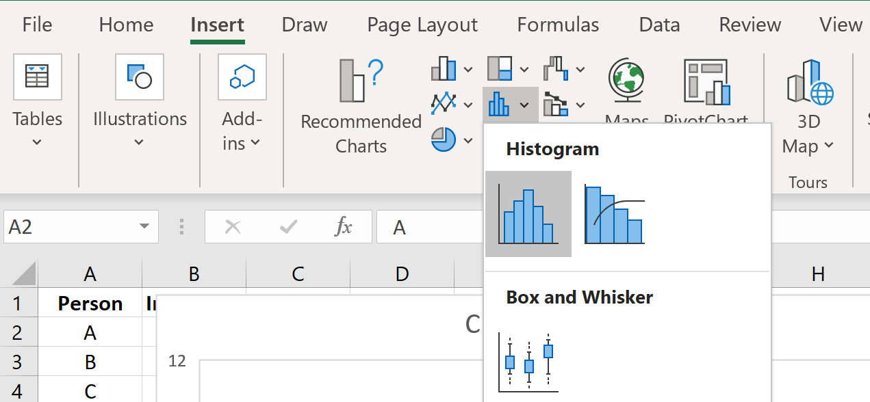
Then we’ll click the INSERT tab along the top ribbon, then we’ll click the Histogram icon within the Charts section.
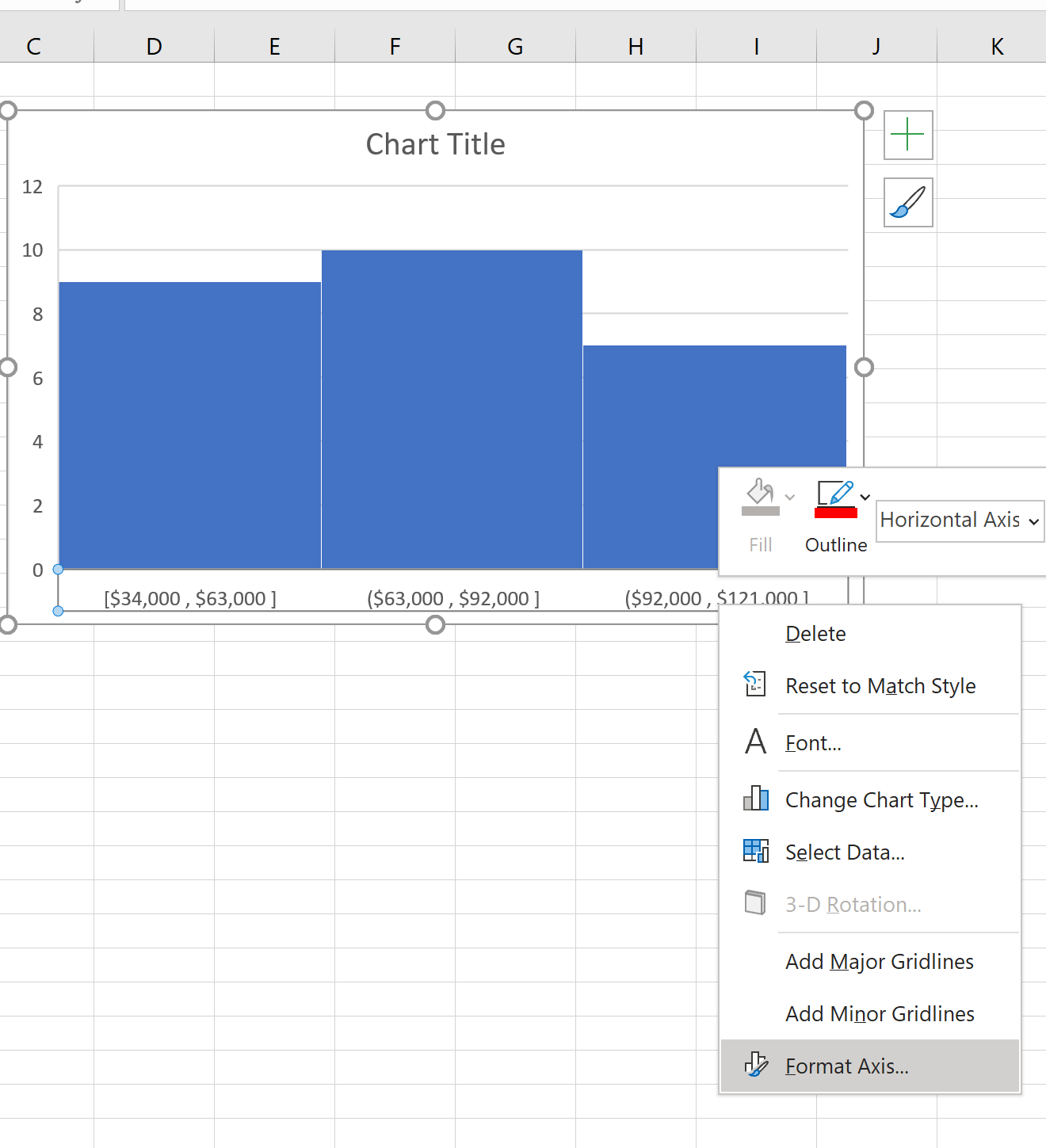
This creates the following histogram by default:
Step 3: Adjust the Bin Width
To adjust the bin width, right click the horizontal axis on the histogram and then click Format Axis from the dropdown:
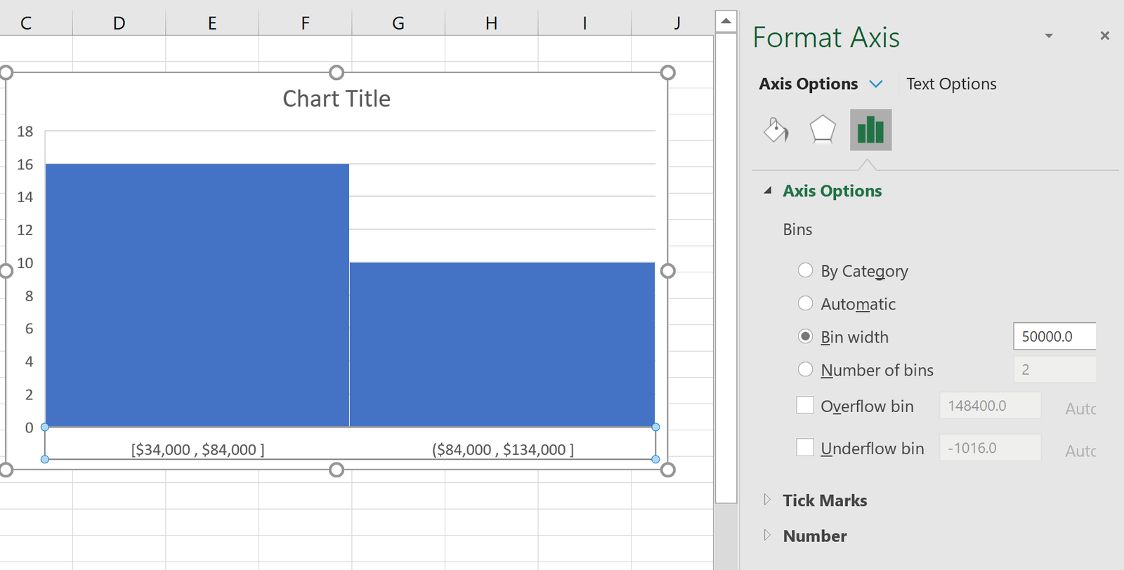
In the window that appears to the right, we can see that Excel chose the bin width to be 29,000. We can change this to any number we’d like.
For example, we could increase the bin width to 50,000:
Notice how this increases the width of each bin and reduces the total number of bins.
We could also decrease the bin width to 10,000:
This decreases the width of each bin and increases the total number of bins in the histogram.
Feel free to modify the bin width to any value you’d like and keep in mind the following rules of thumb:
- Increasing the bin width often decreases the number of total bins in the histogram and leads to fatter and fewer bins.
- Decreasing the bin width often increases the number of total bins in the histogram and leads to narrower and more bins.
You can find more Excel tutorials on this page.


