A cumulative distribution function (CDF) describes the probability that a random variable takes on a value less than or equal to some number.
We can use the following function in Excel to calculate cumulative distribution probabilities:
=NORM.DIST(x, MEAN, STANDARD_DEVIATION, TRUE)
The following example shows how to calculate and plot a CDF in Excel.
Example: Calculate & Plot CDF in Excel
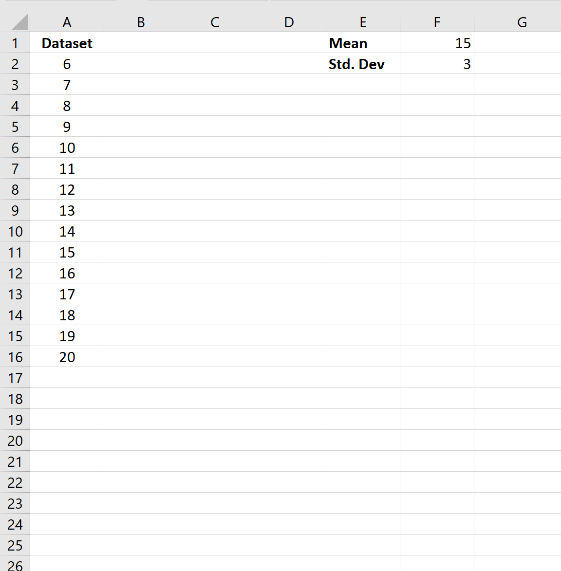
First, let’s create the following dataset in Excel:
Next, let’s specify the mean and standard deviation of the distribution:
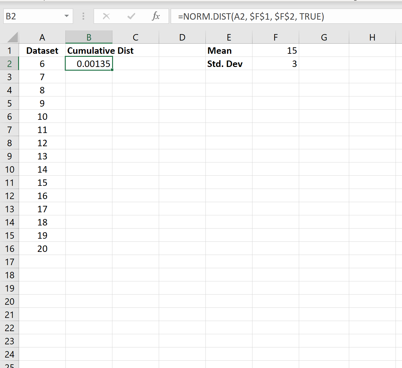
Next, we can calculate the cumulative distribution probability for the first value in the dataset by using the following formula:
=NORM.DIST(A2, $F$1, $F$2, TRUE)
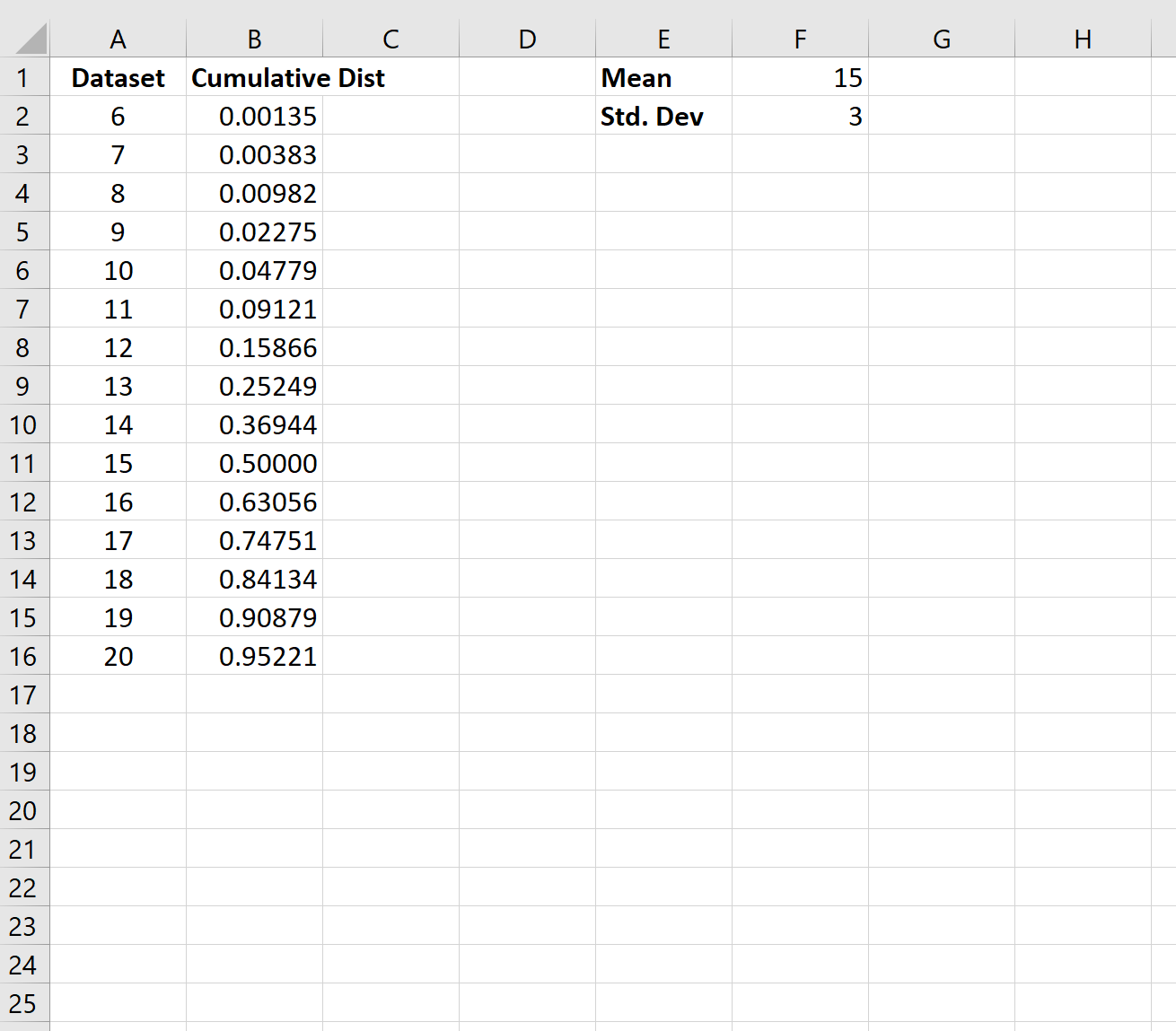
Next, we can copy and paste this formula down to every other cell in column B:
The CDF is now complete. The way we interpret the values is as follows:
- The probability that the random variable will take on a value equal to or less than 6 is .00135.
- The probability that the random variable will take on a value equal to or less than 7 is .00383.
- The probability that the random variable will take on a value equal to or less than 8 is .00982.
And so on.
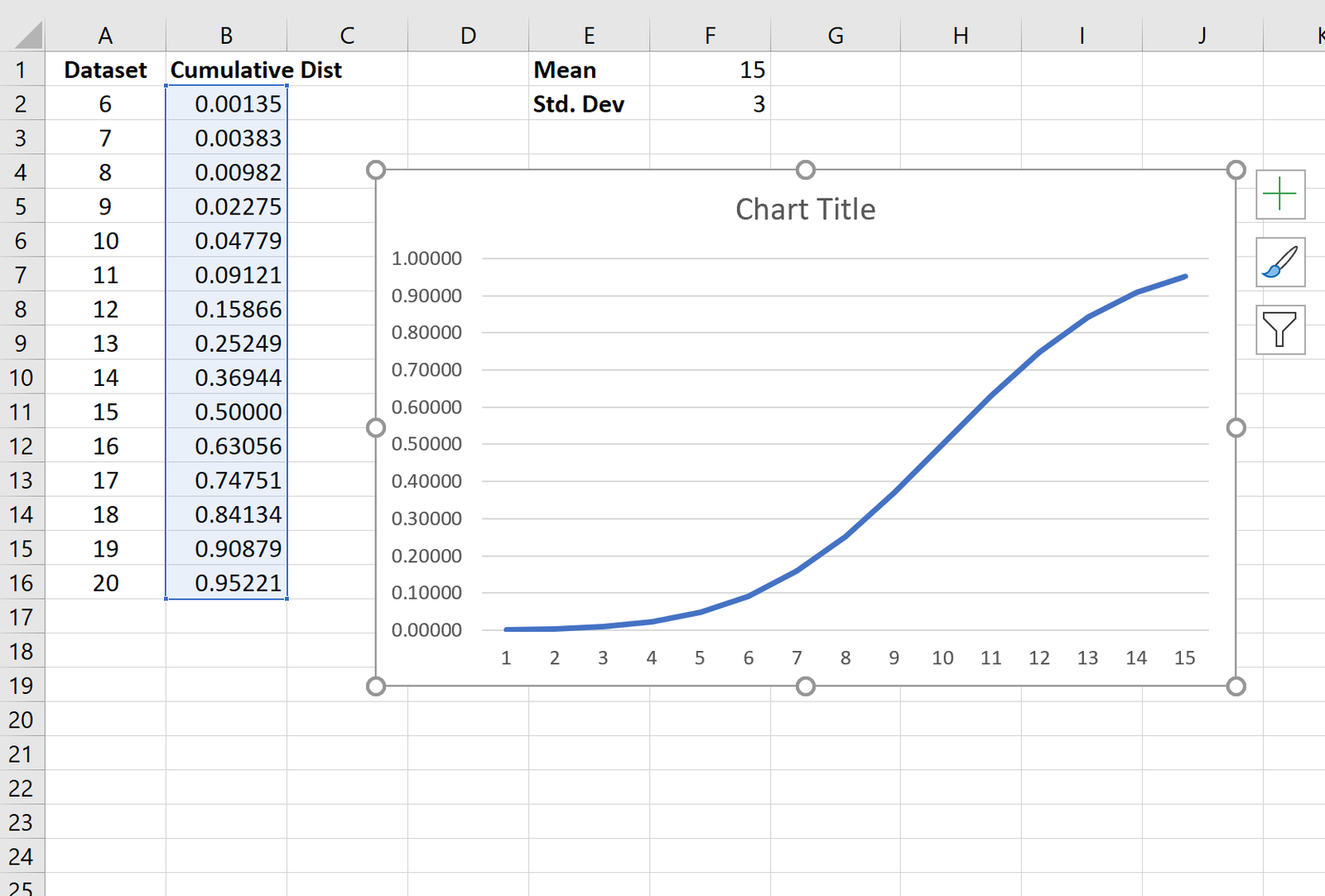
To visualize this CDF, we can highlight every value in column B. Then, we can click the Insert tab along the top ribbon and click Insert Line Chart to produce the following chart:
The values along the x-axis show the values from the dataset and the values along the y-axis show the CDF values.
Additional Resources
CDF vs. PDF: What’s the Difference?
How to Make a Bell Curve in Excel
How to Calculate NormalCDF Probabilities in Excel


