A bubble chart is a type of chart that allows you to visualize three variables in a dataset at once.
The first two variables are used as (x,y) coordinates on a scatterplot and the third variable is used to depict size.
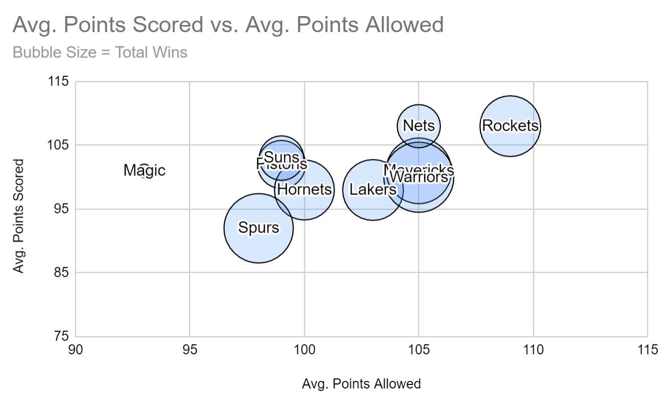
This tutorial provides a step-by-step example of how to create the following bubble chart in Google Sheets:
Step 1: Create the Data
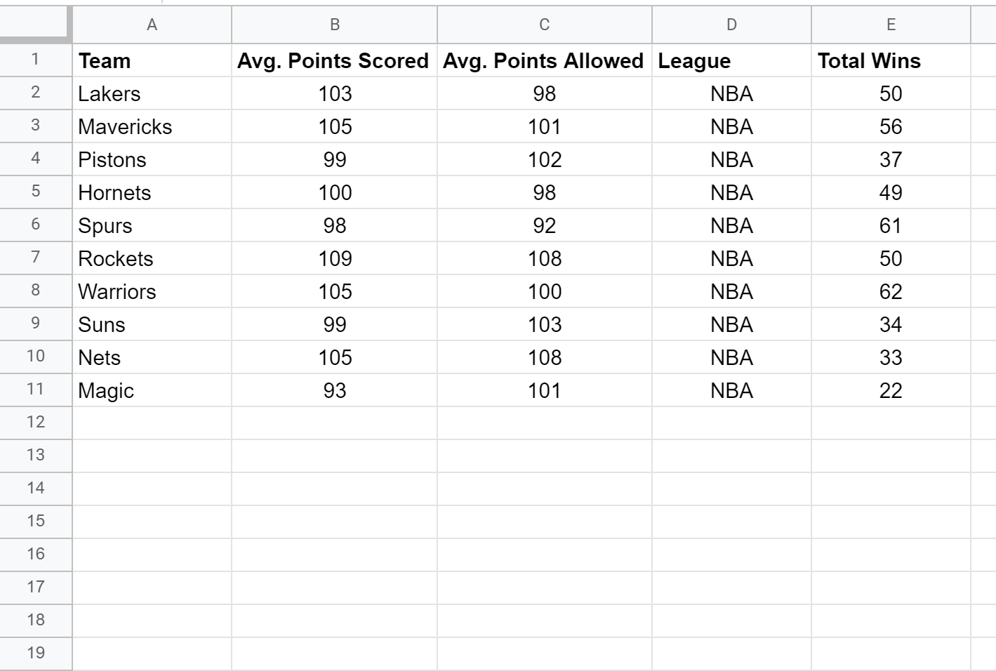
First, let’s create a fake dataset that shows various statistics for 10 different professional basketball teams:
Note that we have to use the following format in order to create a bubble chart in Google Sheets:
- Column A: Labels
- Column B: X-axis value
- Column C: Y-axis value
- Column D: Color
- Column E: Size
Step 2: Create the Bubble Chart
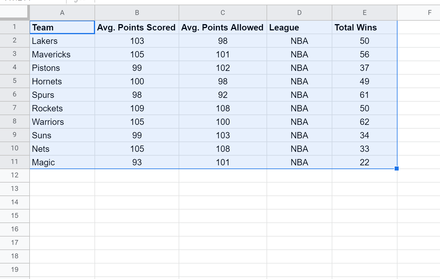
Next, highlight each of the columns of data:
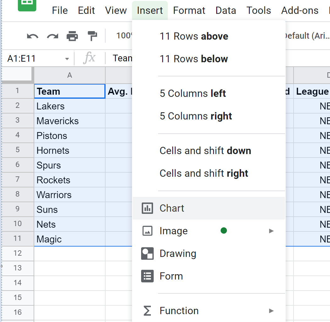
Next, click the Insert tab and then click Chart.
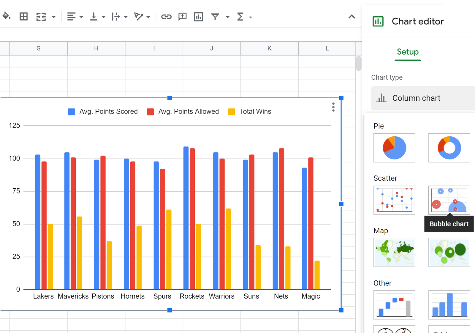
Google Sheets will insert a histogram by default. To convert this into a bubble chart, simply click Chart type in the Chart editor that appears on the right of the screen. Then scroll down and click Bubble chart.
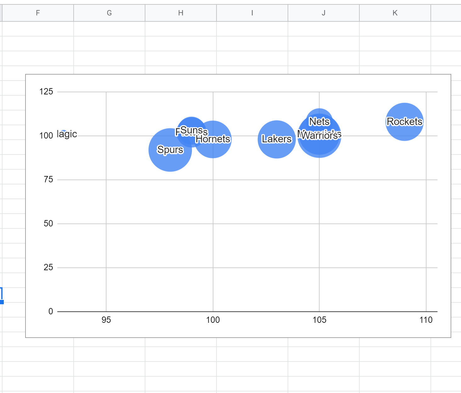
This will automatically produce the following bubble chart:
Step 3: Modify the Bubble Chart
Next, we can modify the appearance of the bubble chart to make it easier to read.
First, double click the vertical axis. In the Chart editor that appears to the right, change the Min and Max axis values to 75 and 115, respectively.
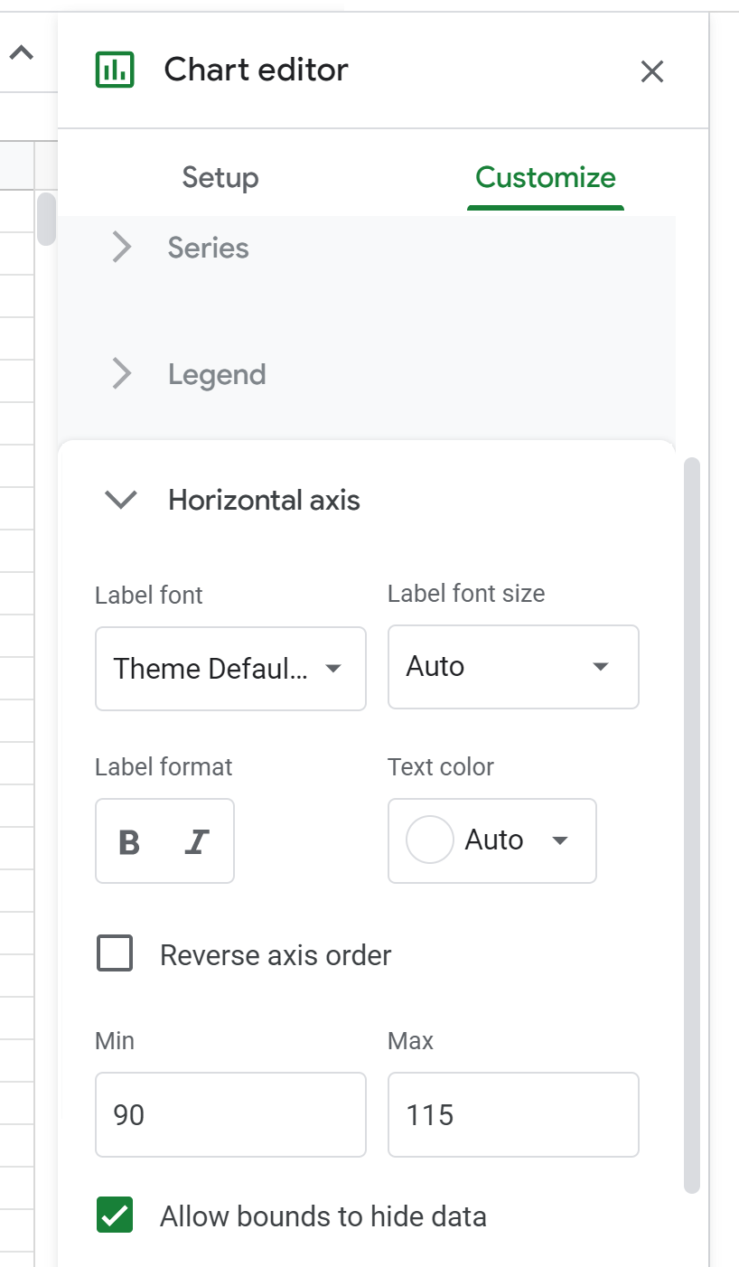
Next, double click the horizontal axis of the chart and change the Min and Max values to 90 and 115, respectively.
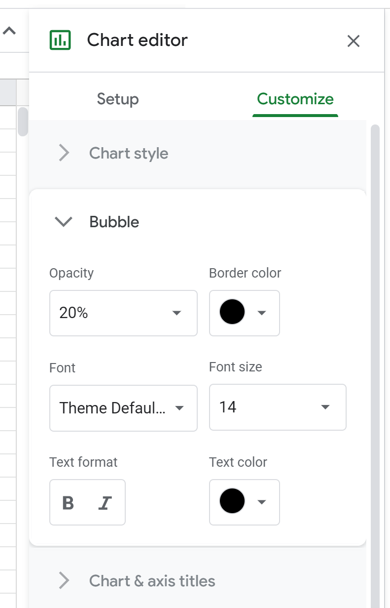
Next, double click the chart again. In the Chart editor, select the Bubble tab and change the Opacity to 20% and the Border Color to black.
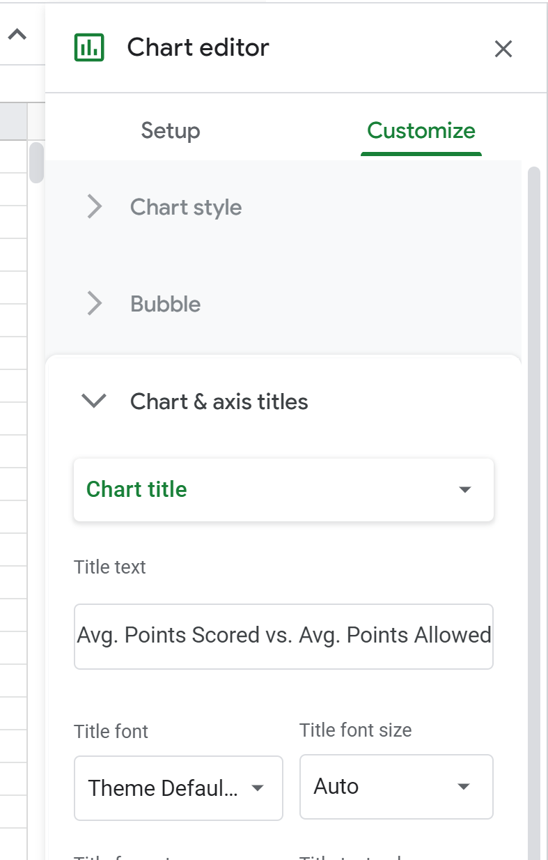
Next, click the Chart & axis titles tab and change the text for the title, subtitle, horizontal axis title, and vertical axis title.
Here is what the final bubble chart will look like:
Additional Resources
The following tutorials explain how to create other common visualizations in Google Sheets:
How to Make a Box Plot in Google Sheets
How to Create a Pareto Chart in Google Sheets
How to Create an Area Chart in Google Sheets


