A Bland-Altman plot is used to visualize the differences in measurements between two different instruments or two different measurement techniques.
It’s useful for determining how similar two instruments or techniques are at measuring the same construct.
This tutorial provides a step-by-step example of how to create a Bland-Altman plot in R.
Step 1: Create the Data
Suppose a biologist uses two different instruments (A and B) to measure the weight of the same set of 20 different frogs, in grams.
We’ll create the following data frame in R that represents the weight of each frog, as measured by each instrument:
#create data
df frame(A=c(5, 5, 5, 6, 6, 7, 7, 7, 8, 8, 9,
                     10, 11, 13, 14, 14, 15, 18, 22, 25),
                 B=c(4, 4, 5, 5, 5, 7, 8, 6, 9, 7, 7, 11,
                     13, 13, 12, 13, 14, 19, 19, 24))

#view first six rows of data
head(df)

  A B
1 5 4
2 5 4
3 5 5
4 6 5
5 6 5
6 7 7
Step 2: Calculate the Difference in Measurements
Next, we’ll create two new columns in the data frame that contain the average measurement for each frog along with the difference in measurements:
#create new column for average measurement
df$avg
#create new column for difference in measurements
df$diff

#view first six rows of data
head(df)

  A B avg diff
1 5 4 4.5    1
2 5 4 4.5    1
3 5 5 5.0    0
4 6 5 5.5    1
5 6 5 5.5    1
6 7 7 7.0    0
Step 3: Calculate the Average Difference & Confidence Interval
Next, we’ll calculate the average difference in measurements between the two instruments along with the upper and lower 95% confidence interval limits for the average difference:
#find average difference
mean_diff
#find lower 95% confidence interval limits
lower

lower

[1] -1.921465

#find upper 95% confidence interval limits
upper

upper

[1] 2.921465
The average difference turns out to be 0.5 and the 95% confidence interval for the average difference is [-1.921, 2.921].
Step 4: Create the Bland-Altman Plot
Next, we’ll use the following code to create a Bland-Altman plot using the ggplot2 data visualization package:
#load ggplot2
library(ggplot2)

#create Bland-Altman plot
ggplot(df, aes(x = avg, y = diff)) +
  geom_point(size=2) +
  geom_hline(yintercept = mean_diff) +
  geom_hline(yintercept = lower, color = "red", linetype="dashed") +
  geom_hline(yintercept = upper, color = "red", linetype="dashed") +
  ggtitle("Bland-Altman Plot") +
  ylab("Difference Between Measurements") +
  xlab("Average Measurement")
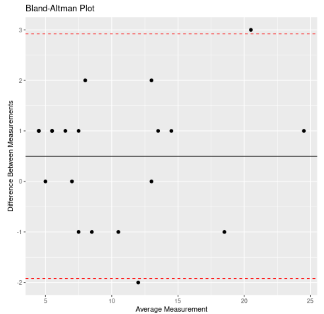
The x-axis of the plot displays the average measurement of the two instruments and the y-axis displays the difference in measurements between the two instruments.
The black line represents the average difference in measurements between the two instruments while the two red dashed lines represent the 95% confidence interval limits for the average difference.