The binomial distribution is used to describe the probability of obtaining k successes in n binomial experiments.
A binomial experiment is an experiment that has the following properties:
- The experiment consists of n repeated trials.
- Each trial has only two possible outcomes.
- The probability of success, denoted p, is the same for each trial.
- Each trial is independent.
If a random variable X follows a binomial distribution, then the probability that X = k successes can be found by the following formula:
P(X=k) = nCk * pk * (1-p)n-k
where:
- n: number of trials
- k: number of successes
- p: probability of success on a given trial
- nCk: the number of ways to obtain k successes in n trials
The following example explains how to create a binomial distribution graph in Excel.
Example: Binomial Distribution Graph in Excel
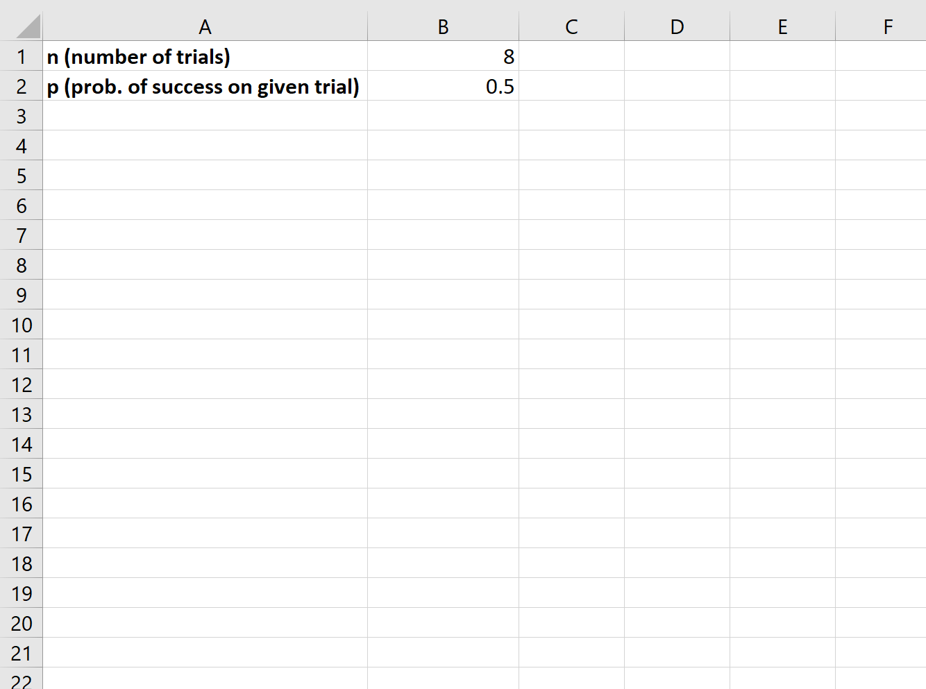
To create a binomial distribution graph, we need to first decide on a value for n (number of trials) and p (probability of success in a given trial):
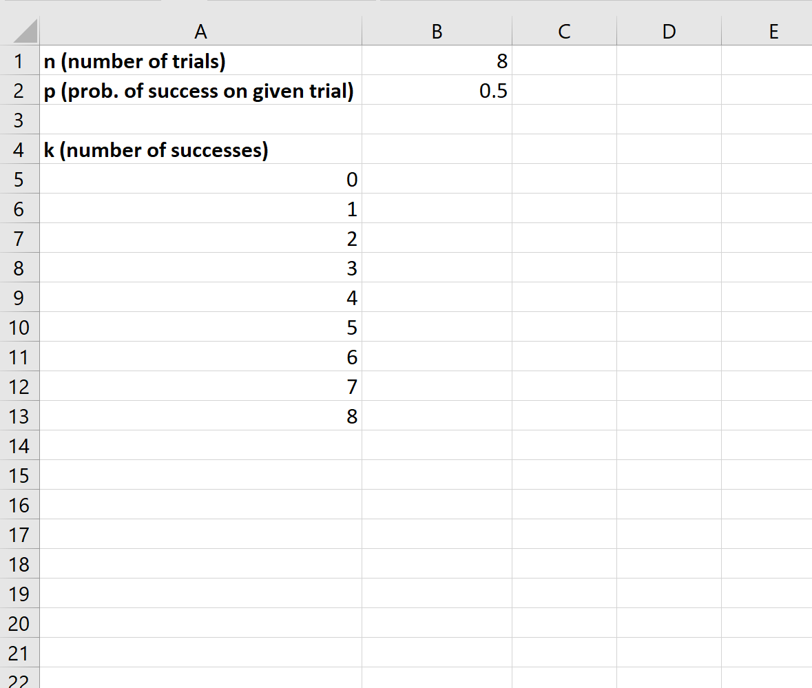
Next, we need to create a column for each possible number of successes:
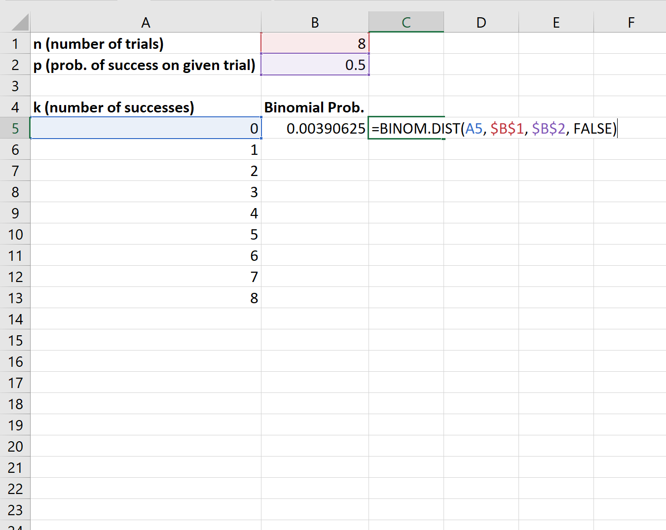
Next, we can use the BINOM.DIST() function to calculate the binomial probability for the first number of successes:
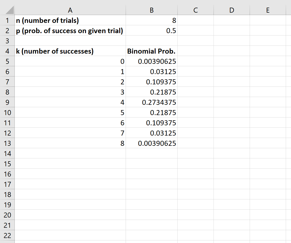
We can then copy and paste this formula to the remaining cells in column B:
Lastly, we can highlight each of the binomial probabilities, then click the Insert tab along the top ribbon, then click the Insert Column or Bar Chart icon in the Charts group:
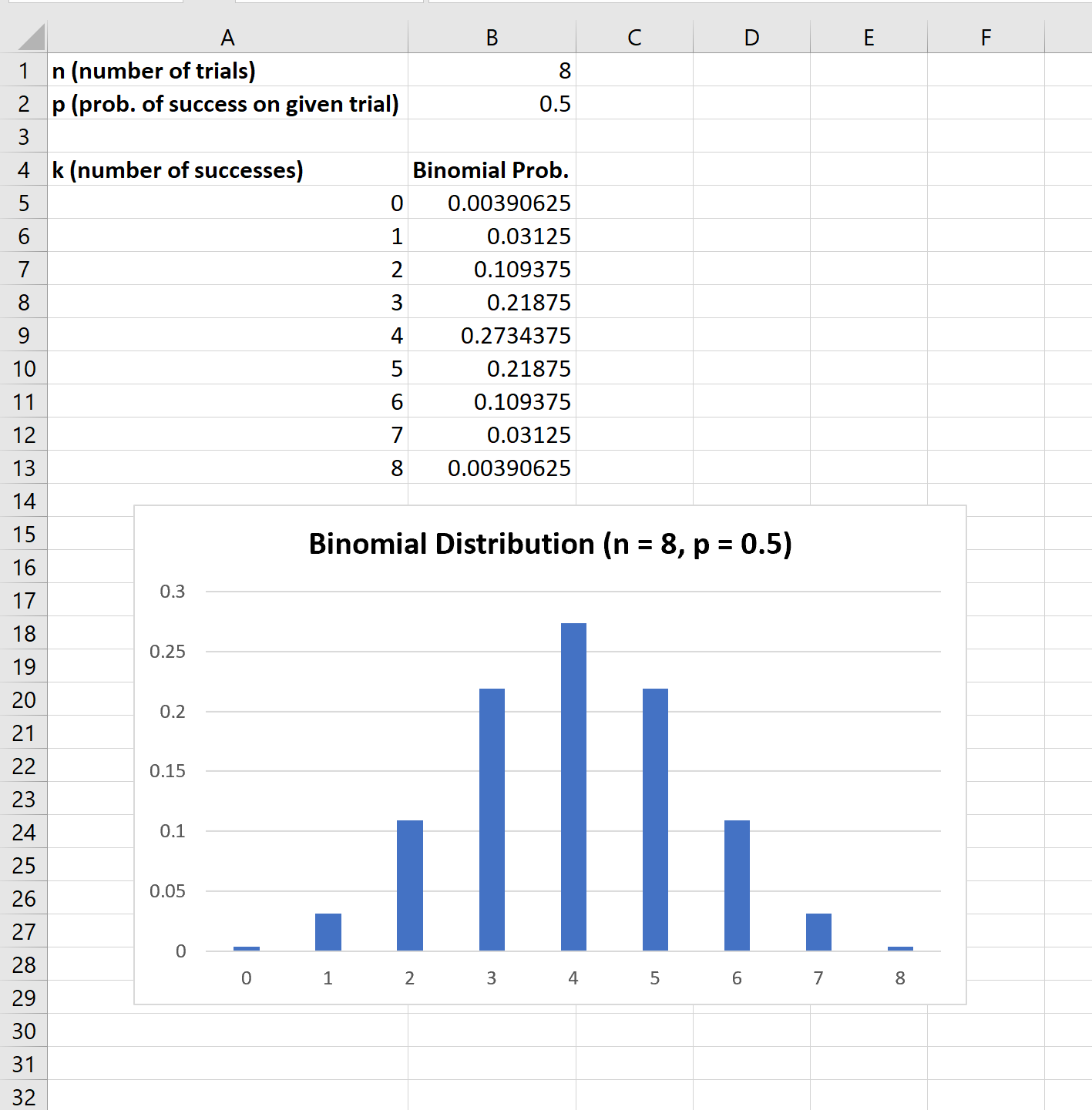
The x-axis of the graph shows the number of successes in 8 trials and the y-axis shows the corresponding probability of that many successes.
Note that if you change the value for either n or p, the graph will automatically change to reflect the new probabilities.
Additional Resources
An Introduction to the Binomial Distribution
Understanding the Shape of a Binomial Distribution
5 Real-Life Examples of the Binomial Distribution