The abline() function in R can be used to add one or more straight lines to a plot in R.
This function uses the following syntax:
- a, b: single values that specify the intercept and slope of the line
- h: the y-value for the horizontal line
- v: the x-value for the vertical line
The following examples show how to use this function in practice.
How to Add Horizontal Lines
The basic code to add a horizontal line to a plot in R is: abline(h = some value)
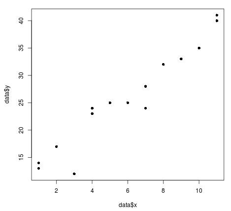
Suppose we have the following scatterplot that displays the values for x and y in a dataset:
#define dataset
data #plot x and y values in dataset
plot(data$x, data$y, pch = 16)
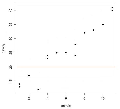
To add a horizontal line at the value y = 20, we can use the following code:
abline(h = 20, col = 'coral2', lwd = 2)
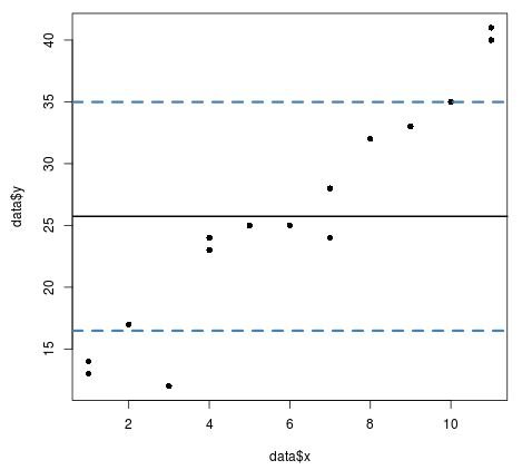
The following code illustrates how to add a horizontal solid line at the mean value of y along with two horizontal dashed lines at one standard deviation above and below the mean value:
#create scatterplot for x and y
plot(data$x, data$y, pch = 16)

#create horizontal line at mean value of y
abline(h = mean(data$y), lwd = 2)

#create horizontal lines at one standard deviation above and below the mean value
abline(h = mean(data$y) + sd(data$y), col = 'steelblue', lwd = 3, lty = 2)
abline(h = mean(data$y) - sd(data$y), col = 'steelblue', lwd = 3, lty = 2)
How to Add Vertical Lines
The basic code to add a vertical line to a plot in R is: abline(v = some value)
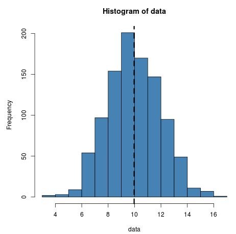
The following code illustrates how to add a vertical line at the mean value on a histogram:
#make this example reproducible
set.seed(0)

#create dataset with 1000 random values normally distributed with mean = 10, sd = 2
data #create histogram of data values
hist(data, col = 'steelblue')

#draw a vertical dashed line at the mean value
abline(v = mean(data), lwd = 3, lty = 2)
How to Add Regression Lines
The basic code to add a simple linear regression line to a plot in R is: abline(model)
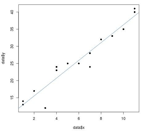
The following code illustrates how to add a fitted linear regression line to a scatterplot:
#define dataset
data #create scatterplot of x and y values
plot(data$x, data$y, pch = 16)

#fit a linear regression model to the data
reg_model #add the fitted regression line to the scatterplot
abline(reg_model, col="steelblue")
Note that we simply need a value for the intercept and the slope to fit a simple linear regression line to the data using the abline() function.
Thus, another way of using abline() to add a regression line is to explicitly specify the intercept and slope coefficients of the regression model:
#define dataset
data #create scatterplot of x and y values
plot(data$x, data$y, pch = 16)

#fit a linear regression model to the data
reg_model #define intercept and slope values
a #intercept
b #slope

#add the fitted regression line to the scatterplot
abline(a=a, b=b, col="steelblue")
Notice that this produces the same line as before.
You can find more R tutorials on this page.


