You can use the following basic syntax to plot multiple lines in ggplot2:
ggplot(df, aes(x=x_var, y=y_var)) +
  geom_line(aes(color=group_var)) +
  scale_color_manual(name='legend_title', labels=c('lab1', 'lab2', 'lab3'),
                     values=c('color1', 'color2', 'color3'))
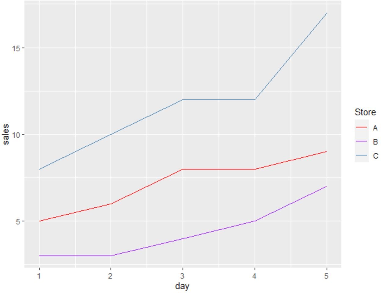
This particular syntax creates a plot in ggplot2 with three lines.
This syntax assumes that your data frame is in a long format.
The following example shows how to plot multiple lines in ggplot2 in practice.
Example: Plot Multiple Lines in ggplot2
Suppose we have the following data frame in R that contains information on the number of sales made at three different stores on five different days:
#create data frame
df frame(day=c(1, 2, 3, 4, 5),
                 storeA=c(5, 6, 8, 8, 9),
                 storeB=c(3, 3, 4, 5, 7),
                 storeC=c(8, 10, 12, 12, 17))

#view data frame
df

  day storeA storeB storeC
1   1      5      3      8
2   2      6      3     10
3   3      8      4     12
4   4      8      5     12
5   5      9      7     17
This data frame is currently in a wide format.
However, we can use the pivot_longer() function from the tidyr package to quickly convert the data into a long format:
library(tidyr)

#convert data from wide to long format
df % pivot_longer(cols=c('storeA', 'storeB', 'storeC'),
                          names_to='store',
                          values_to='sales')

#view updated data frame
df

# A tibble: 15 x 3
     day store  sales

 1     1 storeA     5
 2     1 storeB     3
 3     1 storeC     8
 4     2 storeA     6
 5     2 storeB     3
 6     2 storeC    10
 7     3 storeA     8
 8     3 storeB     4
 9     3 storeC    12
10     4 storeA     8
11     4 storeB     5
12     4 storeC    12
13     5 storeA     9
14     5 storeB     7
15     5 storeC    17
Related: An Introduction to pivot_longer() in R
Now that the data frame is in a long format, we can use the following syntax with ggplot2 to plot the sales by each store:
library(ggplot2)

#plot sales by store
ggplot(df, aes(x=day, y=sales)) +
  geom_line(aes(color=store)) +
  scale_color_manual(name='Store', labels=c('A', 'B', 'C'),
                     values=c('red', 'purple', 'steelblue'))
The individual lines display the sales made at each store on each day.
Note that we used the scale_color_manual() function to create a custom legend on the right side of the plot to make the lines easier to interpret.
Feel free to change the arguments in this function to create a legend that appears exactly how you’d like.
Additional Resources
The following tutorials explain how to perform other common tasks in ggplot2:
How to Plot Mean and Standard Deviation in ggplot2
How to Add a Horizontal Line to a Plot Using ggplot2
How to Draw a Trend Line in ggplot2


