You can use the shape argument to change the shape of points in a ggplot2 scatterplot:
ggplot(df, aes(x=x, y=y)) +
  geom_point(shape=19)
The default value for shape is 19 (a filled-in circle), but you can specify any value between 0 to 25.
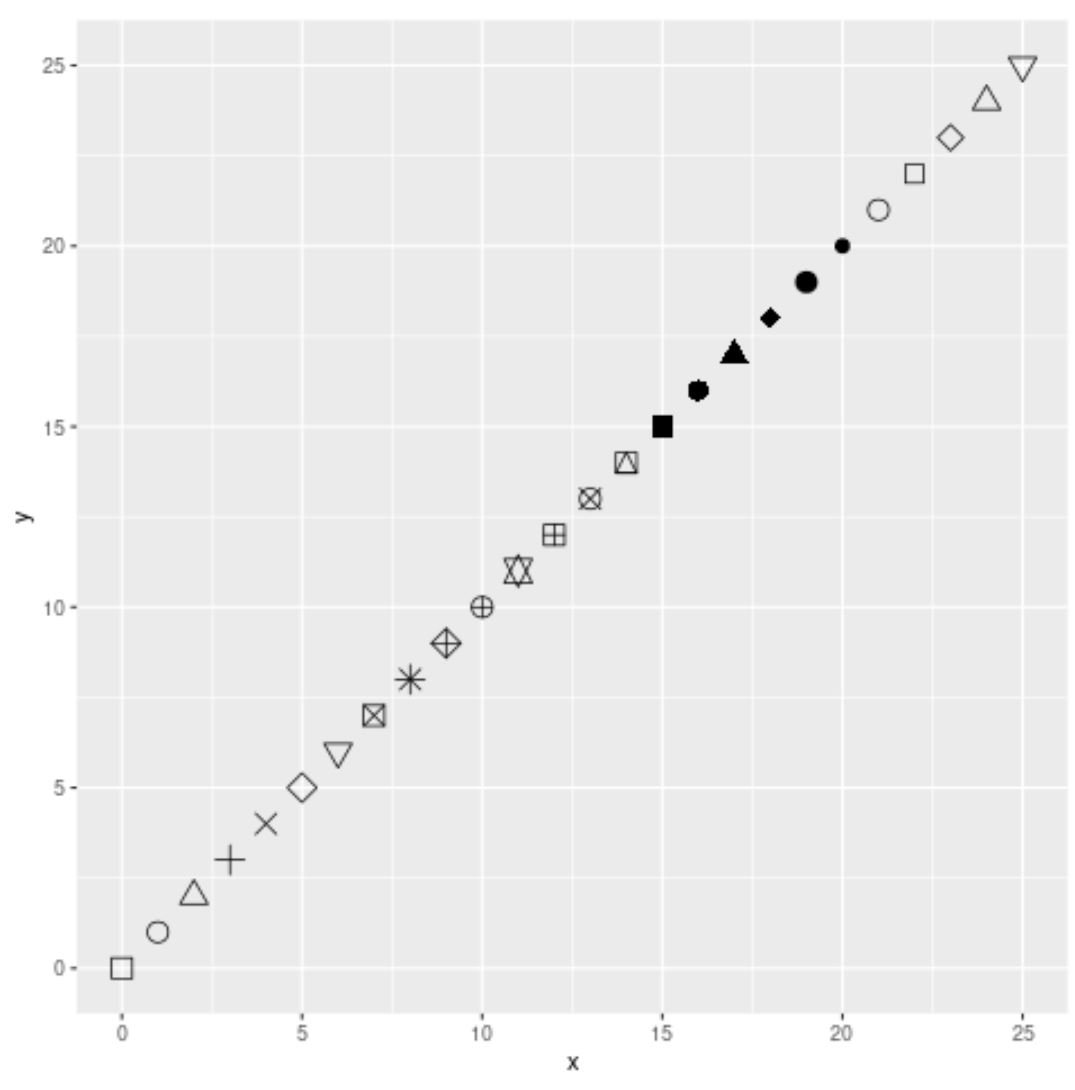
The following chart shows the shapes that correspond to each value:
library(ggplot2)

#create data frame
df frame(x=0:25, y=0:25)

#create scatter plot
ggplot(df, aes(x=x, y=y)) +
  geom_point(shape=0:25, size=4)
The following examples show how to modify the shape argument in different ggplot2 scatter plots.
Example 1: Create Plot with Default Shape
The following code shows how to create a scatter plot in ggplot2 using the default shape (filled-in circle) for the points:
library(ggplot2)

#create data frame
df frame(x=0:25, y=0:25)

#create scatter plot with default point shape
ggplot(df, aes(x=x, y=y)) +
  geom_point(size=4)
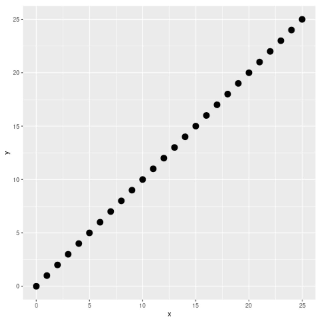
Since we didn’t use the shape argument to specify a point shape, ggplot2 used the default shape of a filled-in circle.
Example 2: Create Plot with Custom Shape
The following code shows how to create a scatter plot in ggplot2 using an empty triangle (shape=2) for the point shape:
library(ggplot2)

#create data frame
df frame(x=0:25, y=0:25)

#create scatter plot with custom point shape
ggplot(df, aes(x=x, y=y)) +
  geom_point(shape=2, size=4)

Example 3: Create Plot with Shape Based on Value
The following code shows how to create a scatter plot in ggplot2 where the shape of the points is based on the value of a particular variable in the data frame:
library(ggplot2)

#create data frame
df frame(team=c('A', 'A', 'B', 'B', 'C', 'C'),
                 points=c(8, 11, 13, 15, 19, 25),
                 assists=c(4, 8, 7, 10, 11, 7))

#create scatter plot where point shape is based on team
ggplot(df, aes(x=points, y=assists, group=team)) +
  geom_point(aes(shape=team, color=team), size=4)
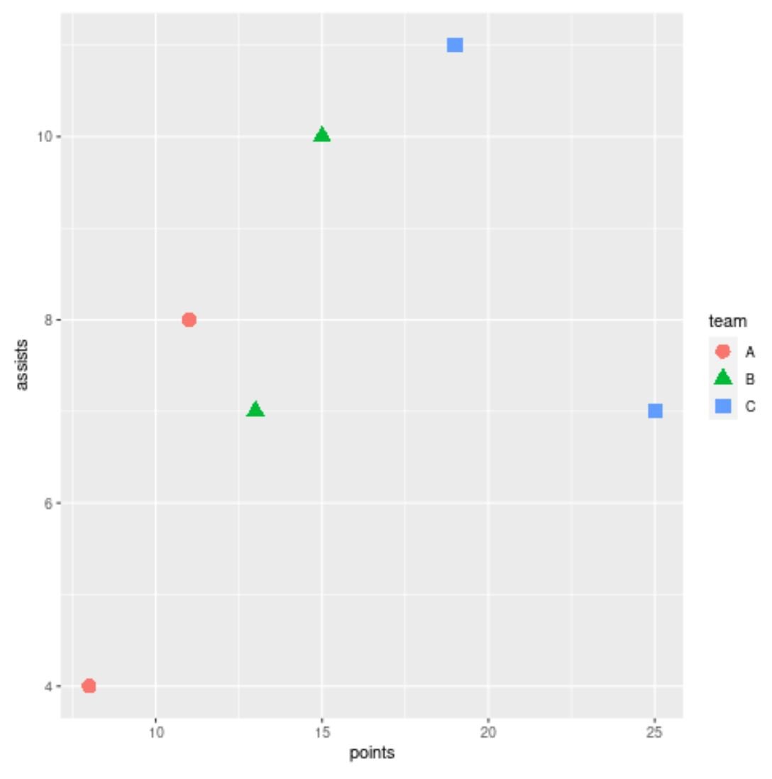 Notice that the shape and color of the points in the plot are both based on the value for the team variable.
Notice that ggplot2 also automatically produces a legend on the right side of the plot to show which points correspond to which team.
Note: You can find the complete documentation for the geom_point() function here.
Additional Resources
The following tutorials explain how to perform other common operations in ggplot2:
How to Change the Legend Title in ggplot2
How to Rotate Axis Labels in ggplot2
How to Fix in R: could not find function “ggplot”