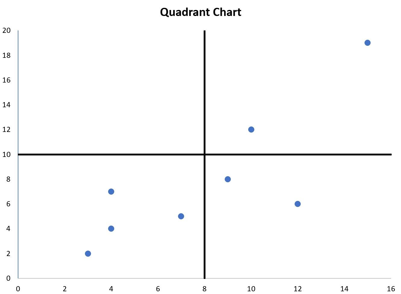
A quadrant chart is a type of chart that allows you to visualize points on a scatter plot in four distinct quadrants.
This tutorial provides a step-by-step example of how to create the following quadrant chart in Excel:
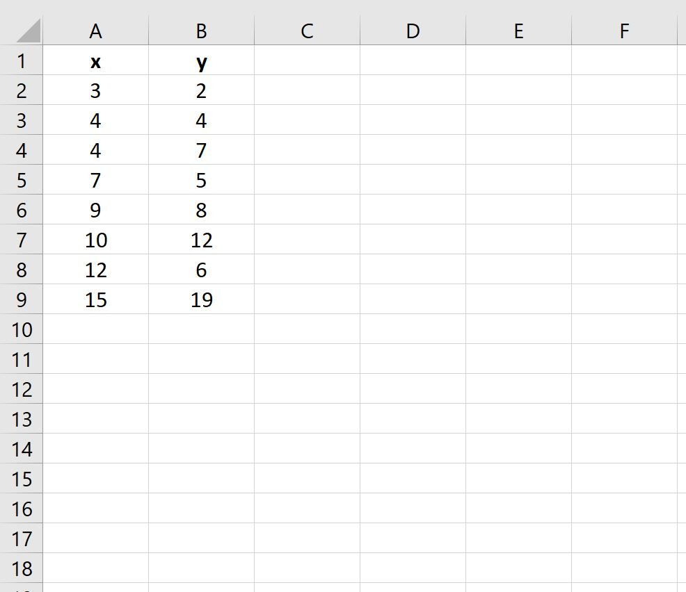
Step 1: Enter the Data
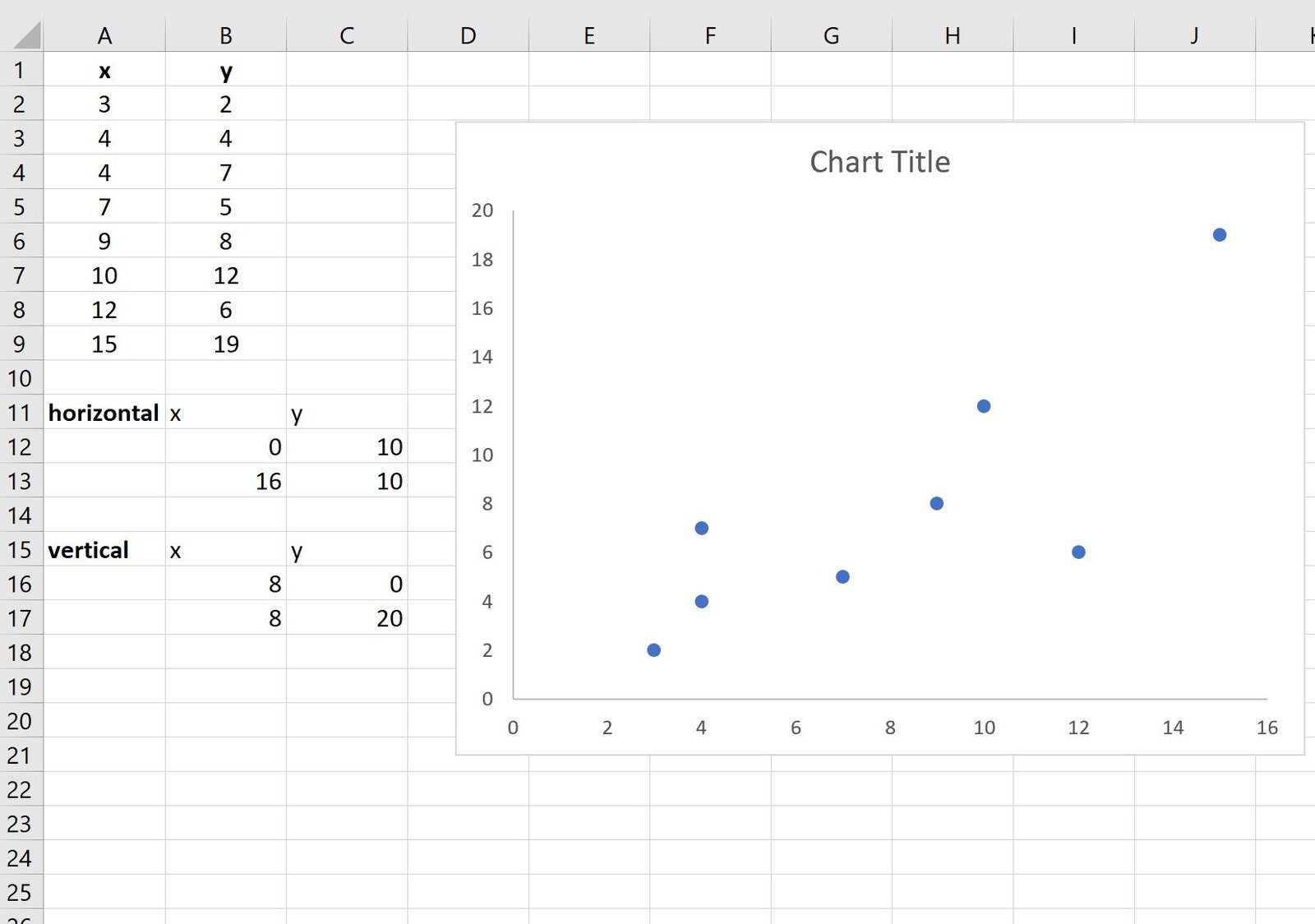
First, let’s enter the following dataset of x and y values in Excel:
Step 2: Create a Scatter Plot
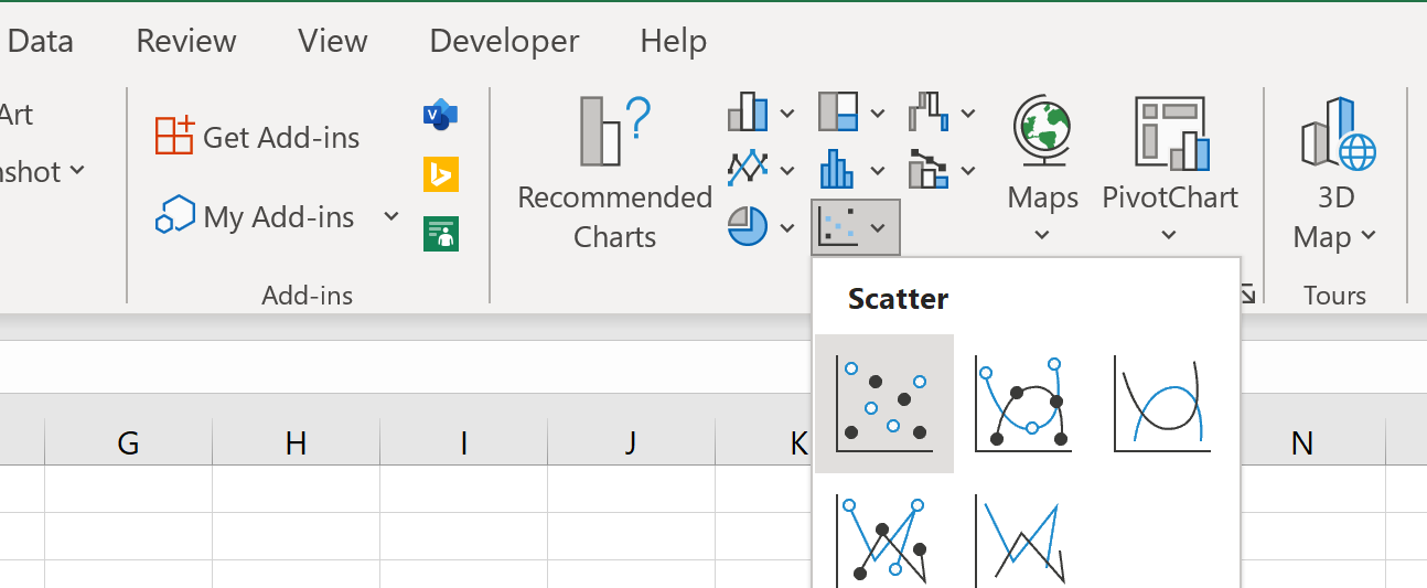
Next, highlight the cells in the range A2:B9, then click the Insert tab, then click the Scatter option in the Charts group:
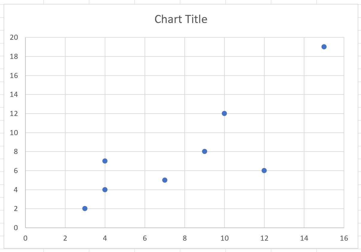
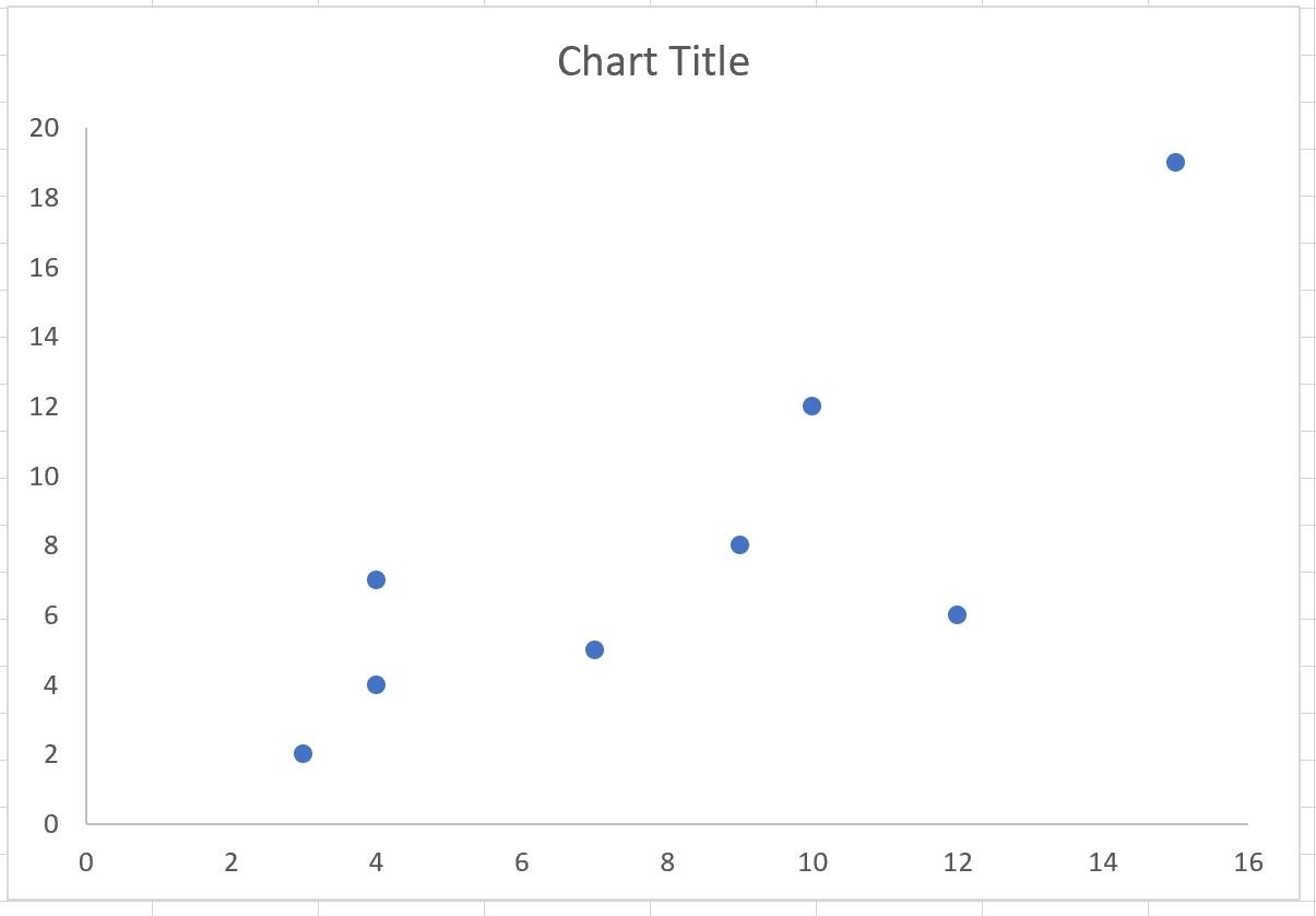
Excel will automatically insert the following scatter plot:
Step 3: Create the Quadrant Chart
To turn this scatter plot into a quadrant chart, we’ll first click on the horizontal and vertical gridlines and delete both:
Next, we need to add a vertical line in the middle of the x-axis range and a horizontal line in the middle of the y-axis range.
Here’s how to calculate the values for the horizontal line:
- x-values: The min and max values of the x-axis
- y-values: The average of the min and max values of the y-axis
Here’s how to calculate the values for the vertical line:
- x-values: The average of the min and max values of the x-axis
- y-values: The min and max values of the y-axis
The following screenshot shows how to calculate the values for both the horizontal and vertical lines:
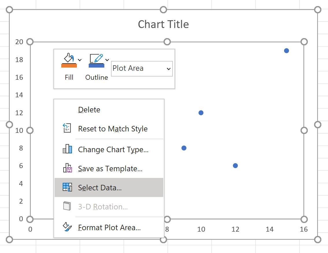
Next, right click anywhere on the scatter plot and click Select Data:
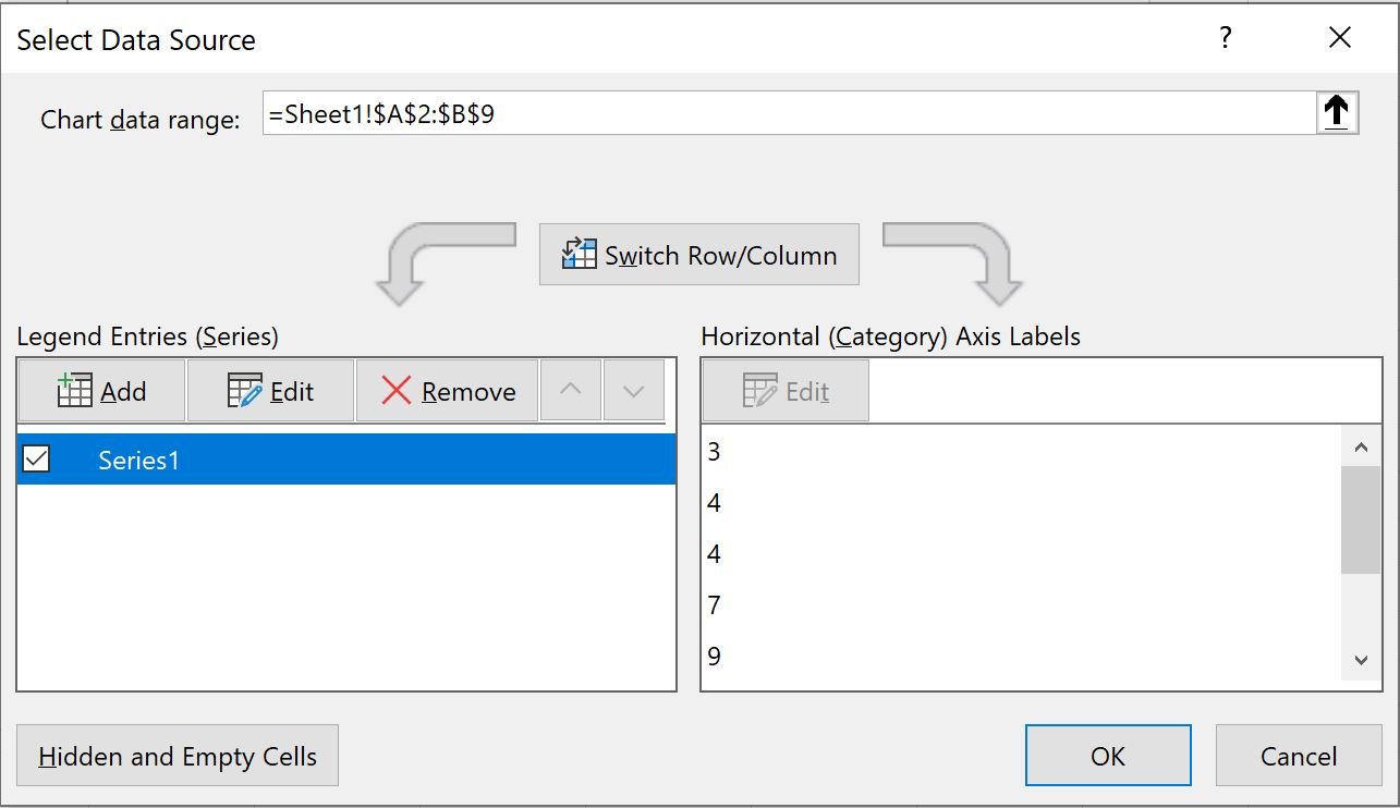
In the new window that appears, click Add:
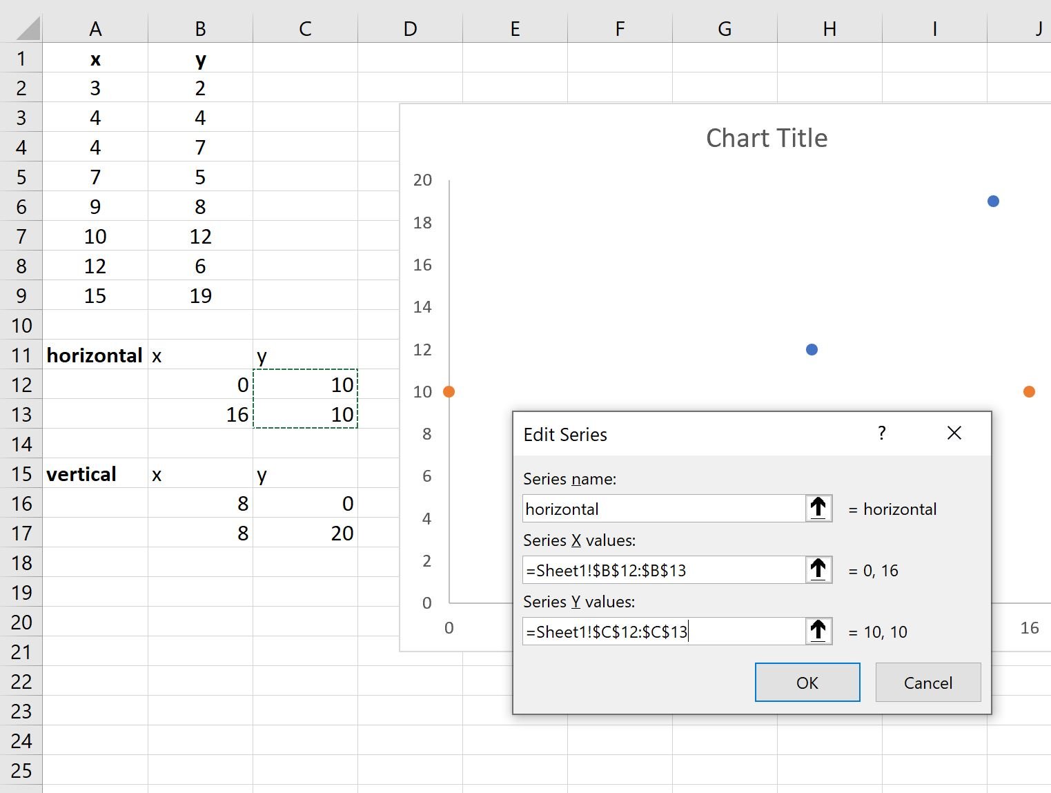
In the new window that appears, type any name you’d like in the Series name box, then choose B12:B13 in the Series X Values box, then type C12:C13 in the Series Y Values Box, then click OK:
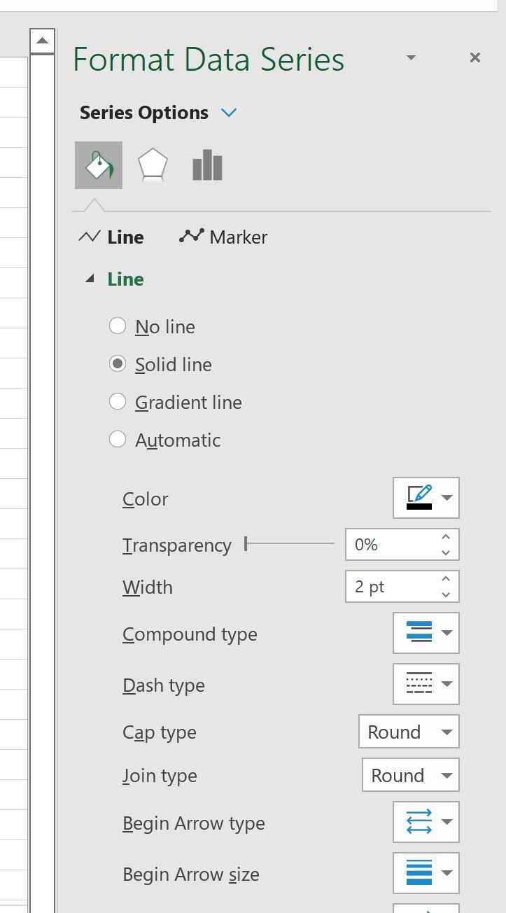
Two orange dots will be added to the plot. Click on either dot to bring up the Format Data Series panel on the right side of the screen.
Then click the Line icon, then click Solid line and choose Black as the Color:
Then click the Marker icon, then click None:
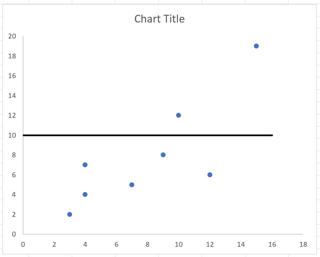
The following horizontal line will automatically be added to the chart:
Repeat this exact same process to add the vertical line to the chart.
The result will the following quadrant chart:
There are now four distinct quadrants in the chart and each point in the chart falls in one of the four quadrants.
Additional Resources
The following tutorials explain how to create other common visualizations in Excel:
How to Create a Gantt Chart in Excel
How to Create a Bubble Chart in Excel
How to Create a Double Doughnut Chart in Excel


