A trendline is a line that shows the general trend of data points in a chart.
The following step-by-step example shows how to add a trendline to a chart in Google Sheets.
Step 1: Enter the Data
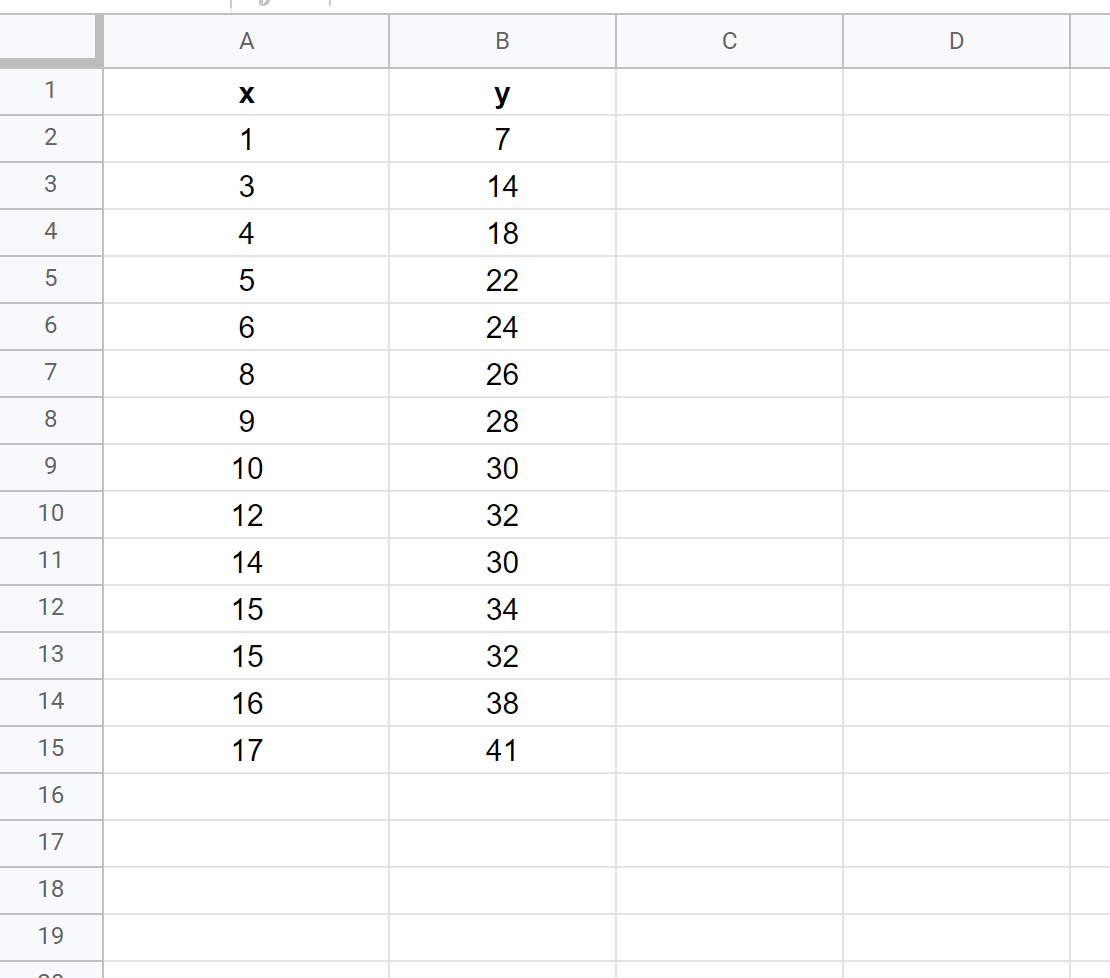
First, let’s enter the values for the following dataset:
Step 2: Create a Chart
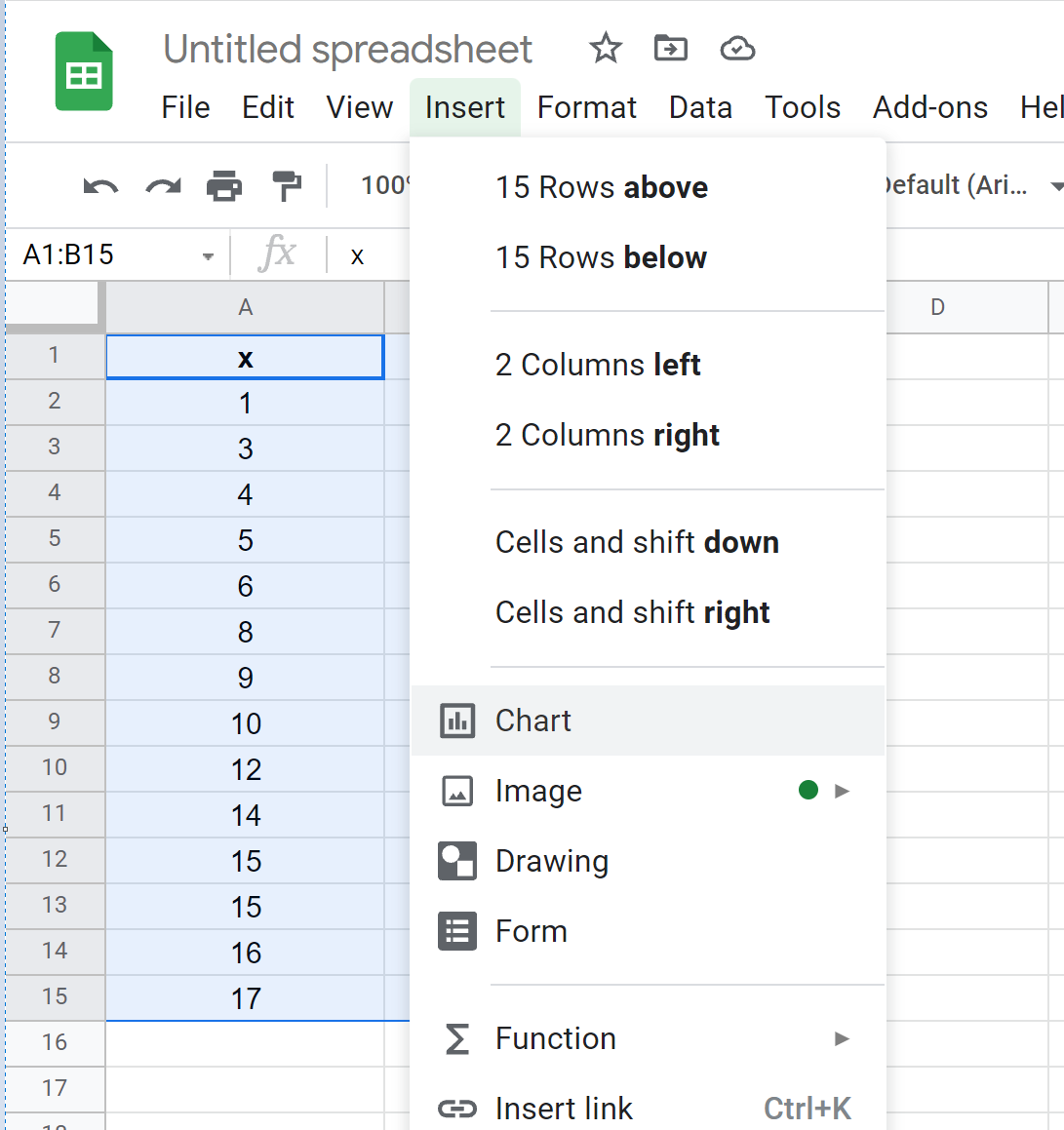
Next, highlight the values in the range A1:B15. Then click the Insert tab, then click Chart.
In the Chart editor panel on the right side of the screen, choose Scatter chart as Chart type.
The following scatterplot will appear:
Step 3: Add a Trendline
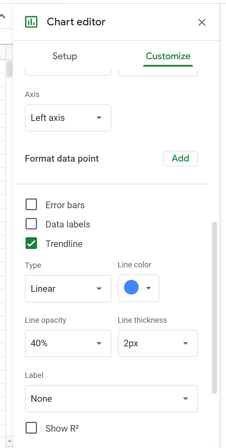
To add a trendline to the chart, click the Customize tab in the Chart editor. Then click Series from the dropdown list, then click the checkbox next to Trendline.
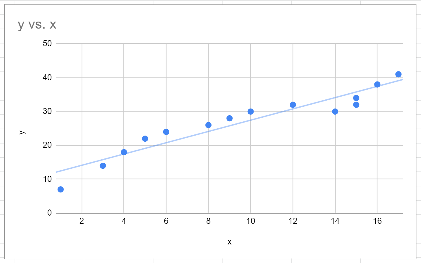
The following linear trendline will automatically be added to the scatterplot:
Step 4: Modify the Trendline
Feel free to modify the aesthetics of the trendline.
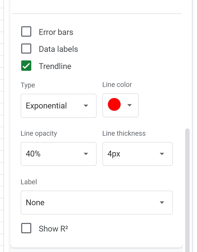
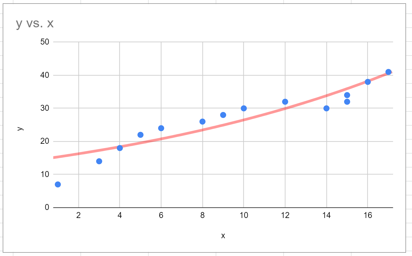
For example, we may choose to change the Type of trendline to Exponential, change the Line color to red, and the Line thickness to 4px.
Here’s how the resulting trendline looks:
Feel free to modify the type of trendline until you find one that seems to fit the data points well.
Additional Resources
The following tutorials explain how to perform other common operations in Google Sheets:
How to Find Line of Best Fit in Google Sheets
How to Add Error Bars to Charts in Google Sheets
How to Add a Horizontal Line to a Chart in Google Sheets


