Occasionally you may want to add a horizontal line to a chart in Google Sheets to represent a target line, an average line, or some other metric.
This tutorial provides a step-by-step example of how to quickly add a horizontal line to a chart in Google Sheets.
Step 1: Create the Data
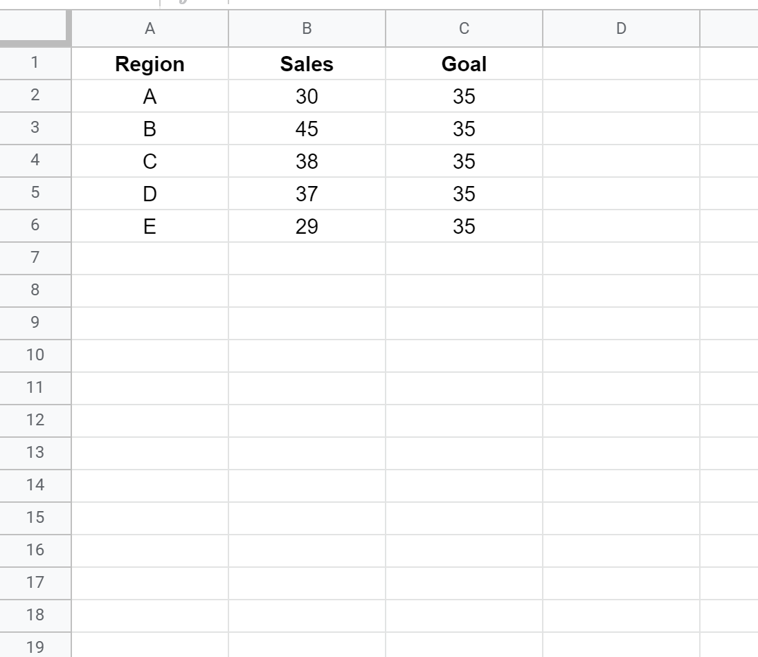
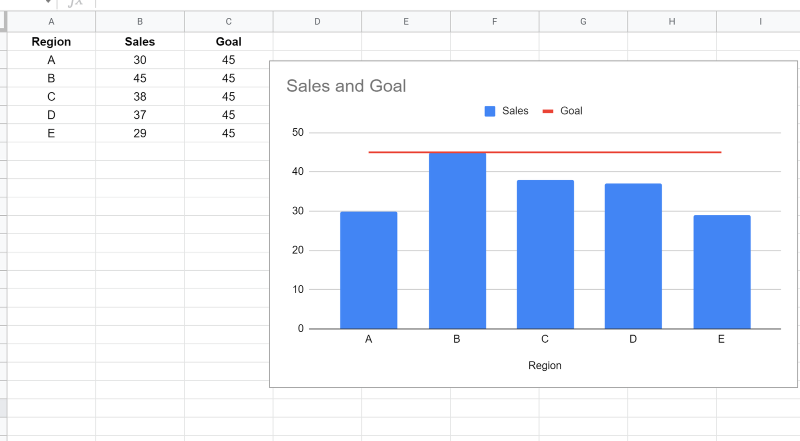
For this example, we’ll create the following fake dataset that shows the total sales and the goal for total sales in five different regions for a certain company:
Step 2: Create a Combo Chart
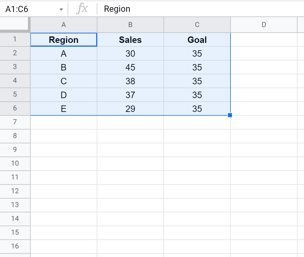
Next, we’ll highlight cells A1:C6 as follows:
Next, click the Insert tab. Then click Chart from the dropdown menu:
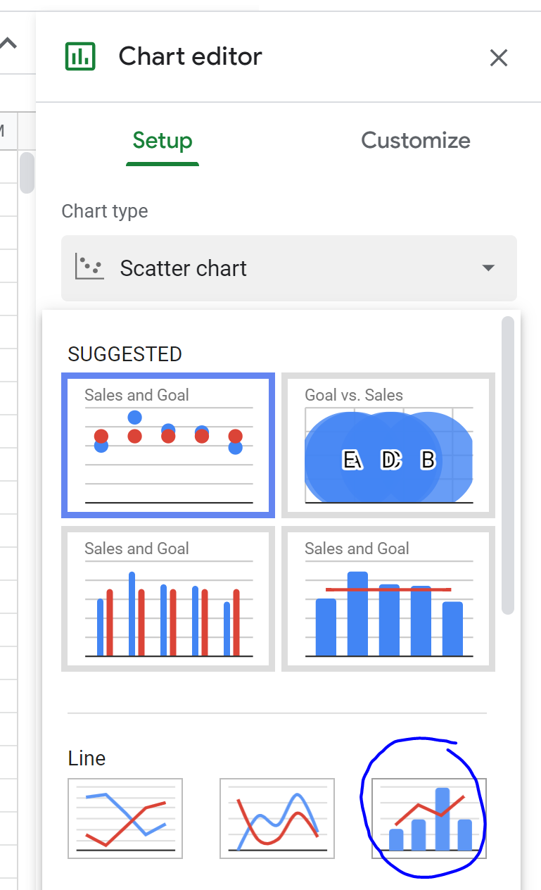
In the Chart Editor that appears to the right, click Chart type and select Combo chart:
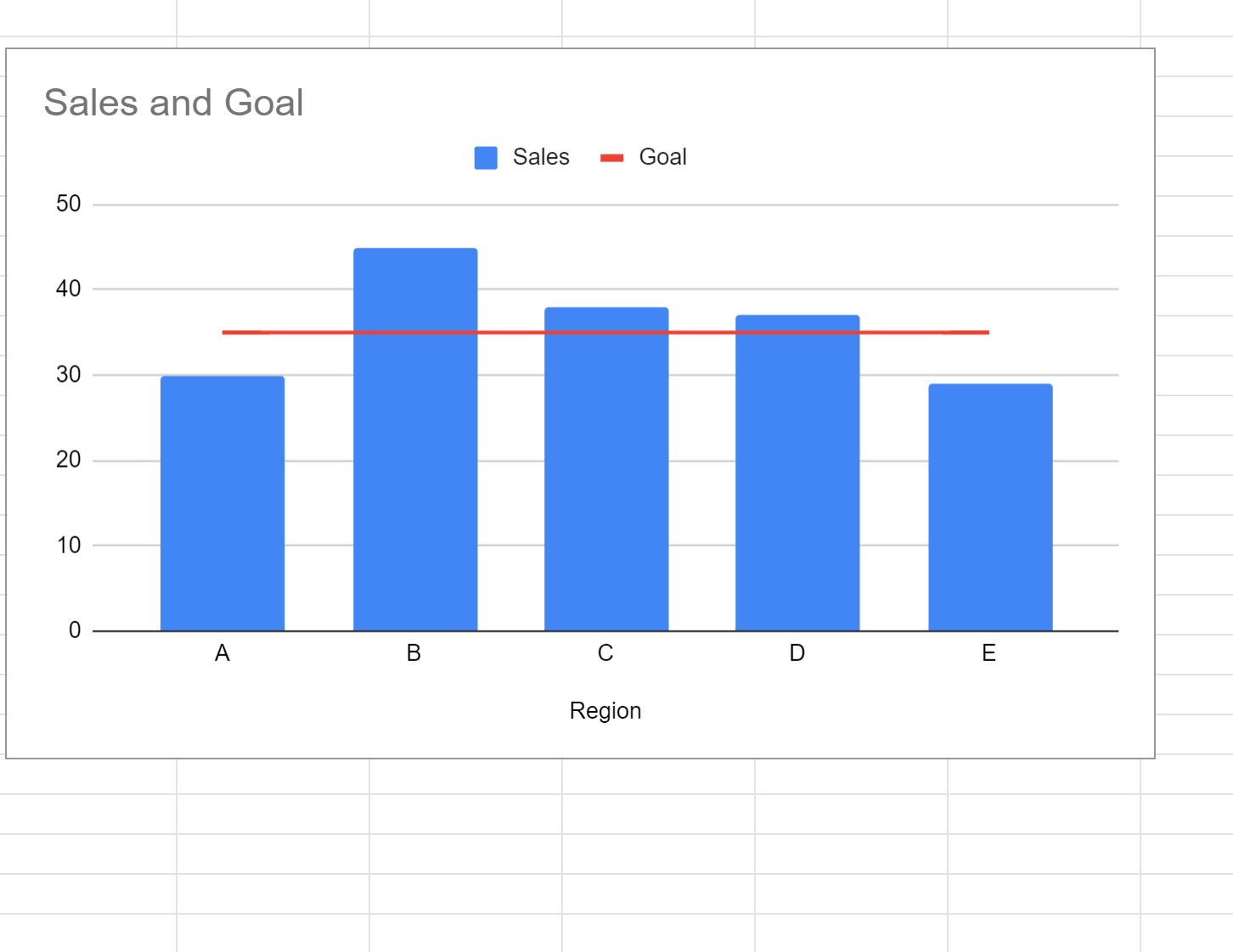
The following chart will appear that displays a bar for the sales of each region and a horizontal line that displays the goal for the sales:
This chart allows us to quickly see which regions have met (or exceeded) the sales goal and which regions have fallen short.
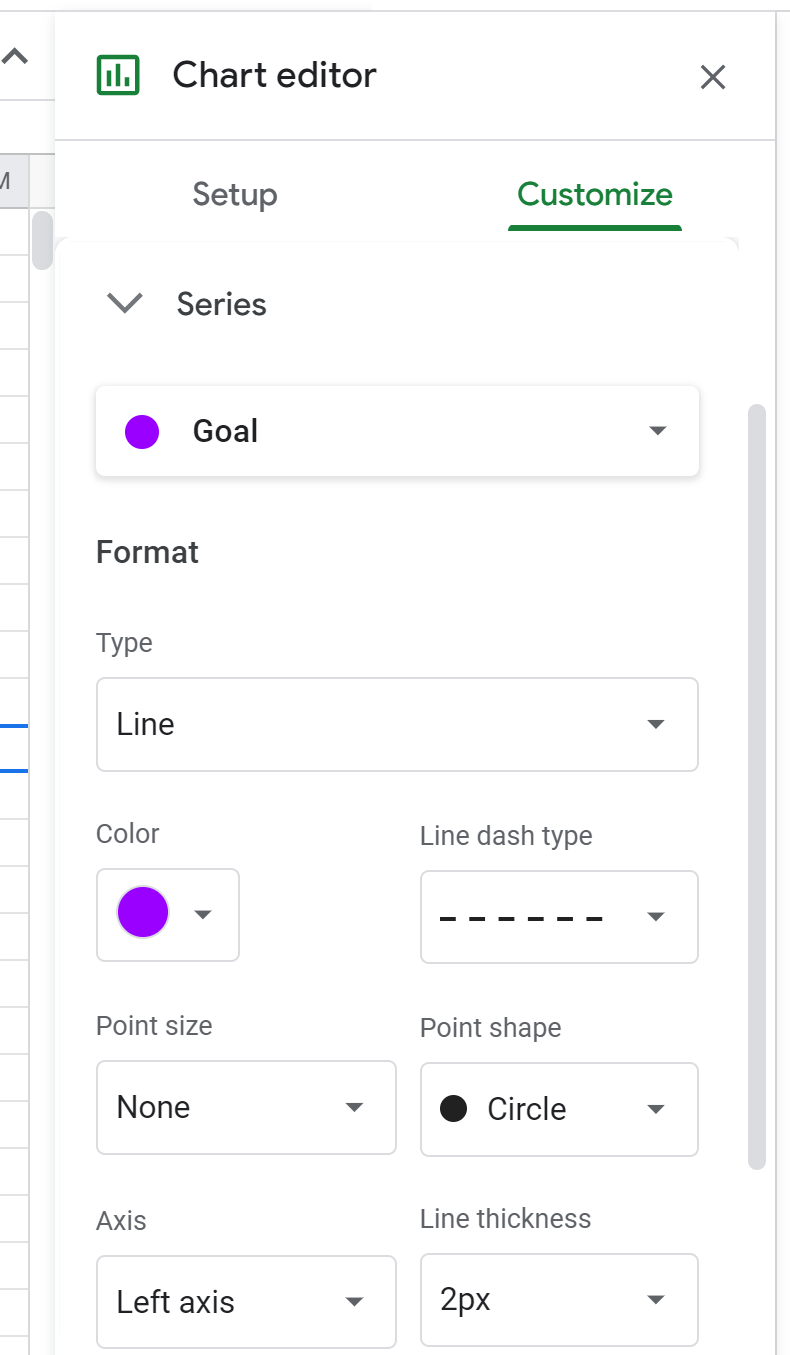
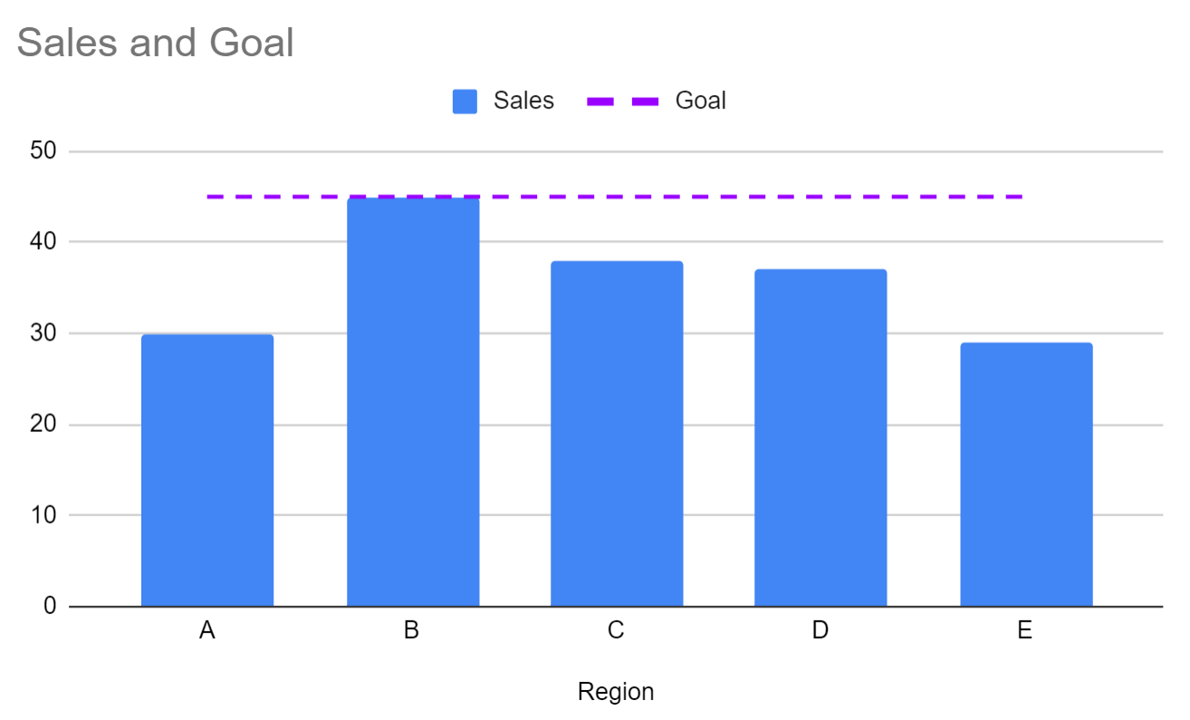
Note that we can also customize the color and the style of the line in the chart. For example, we could modify the line to be purple and dashed:
This results in the following line:
Step 3: Modify the Horizontal Line Value (Optional)
If we modify the values in the Goal column, the red horizontal line will automatically change in the chart.
For example, if we change the sales goal to 45 in the Goal column, the red line will automatically increase to 45 on the chart:
Additional Resources
The following tutorials explain how to perform other common operations in Google Sheets:
How to Add a Vertical Line to a Chart in Google Sheets
How to Add Error Bars to Charts in Google Sheets
How to Add Trendline to Chart in Google Sheets
How to Add Labels to Scatterplot Points in Google Sheets


