One of the main assumptions of linear regression is that the residuals are normally distributed.
One way to visually check this assumption is to create a histogram of the residuals and observe whether or not the distribution follows a “bell-shape” reminiscent of the normal distribution.
This tutorial provides a step-by-step example of how to create a histogram of residuals for a regression model in R.
Step 1: Create the Data
First, let’s create some fake data to work with:
#make this example reproducible
set.seed(0)

#create data
x1 #view first six rows of data
head(data)

        x1        x2          y
1 3.262954 6.3455776 -1.1371530
2 1.673767 1.6696701 -0.6886338
3 3.329799 2.1520303  5.8081615
4 3.272429 4.1397409  3.7815228
5 2.414641 0.6088427  4.3269030
6 0.460050 5.7301563  6.6721111
Step 2: Fit the Regression Model
Next, we’ll fit a multiple linear regression model to the data:
#fit multiple linear regression model
model
Step 3: Create a Histogram of Residuals
Lastly, we’ll use the ggplot visualization package to create a histogram of the residuals from the model:
#load ggplot2
library(ggplot2)
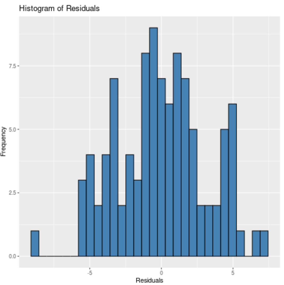
#create histogram of residuals
ggplot(data = data, aes(x = model$residuals)) +
geom_histogram(fill = 'steelblue', color = 'black') +
labs(title = 'Histogram of Residuals', x = 'Residuals', y = 'Frequency')
Note that we can also specify the number of bins to place the residuals in by using the bin argument.
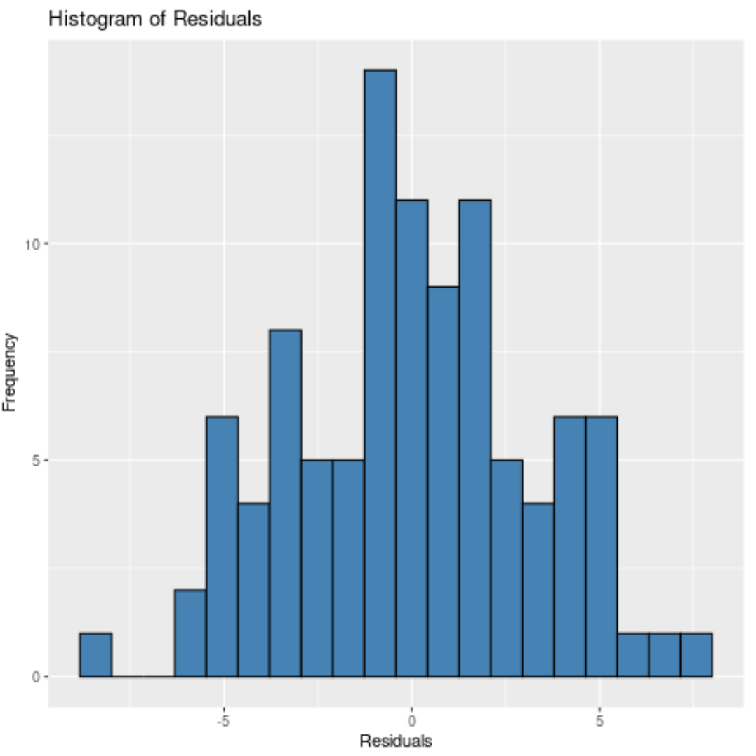
The fewer the bins, the wider the bars will be in the histogram. For example, we could specify 20 bins:
#create histogram of residuals
ggplot(data = data, aes(x = model$residuals)) +
    geom_histogram(bins = 20, fill = 'steelblue', color = 'black') +
    labs(title = 'Histogram of Residuals', x = 'Residuals', y = 'Frequency')
Or we could specify 10 bins:
#create histogram of residuals
ggplot(data = data, aes(x = model$residuals)) +
    geom_histogram(bins = 10, fill = 'steelblue', color = 'black') +
    labs(title = 'Histogram of Residuals', x = 'Residuals', y = 'Frequency')
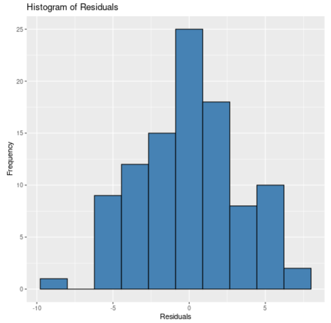
No matter how many bins we specify, we can see that the residuals are roughly normally distributed.
We could also perform a formal statistical test like the Shapiro-Wilk, Kolmogorov-Smirnov, or Jarque-Bera to test for normality.
However, keep in mind that these tests are sensitive to large sample sizes – that is, they often conclude that the residuals are not normal when the sample size is large.
For this reason, it’s often easier to assess normality by creating a histogram of the residuals.